Beginning the week with Ryan Sands and Frank Santoro talking risograph printing, new work from Ron Rege Jr. and Brian Chippendale, thoughts on creating comic strips from Ben Katchor, and more.
—————————————————————————————————
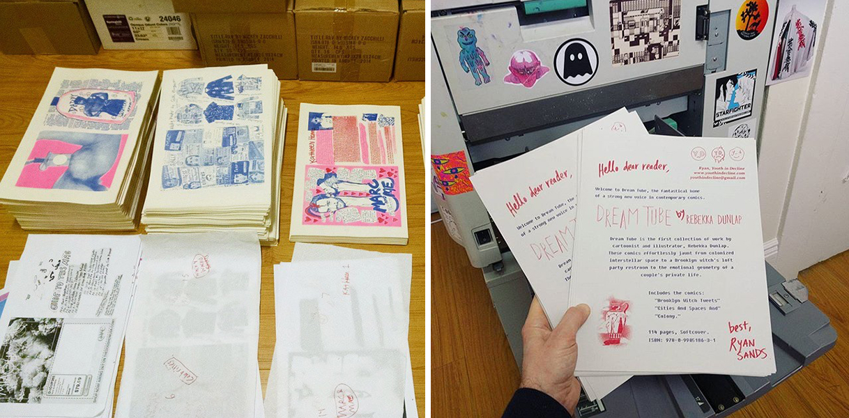
The Risograph Workbook series on The Comics Journal continues with Ryan Sands, publisher at Youth in Decline, sharing his riso story.
“People ask me about risograph a lot, and I get hesitant to characterize it as a look or aesthetic unto itself. The machine is just a means to production, and how artists mess with it and use it is a reflection of their priorities and style – Mickey uses the riso to maintain spontaneity and a handmade griminess to the comics, while someone like John Pham applies his printmaking emphasis and precision to create these really sharp and dense books full of color and gradients. Then there are folks like Ryan Cecil Smith, and Colour Code Printing‘s Jesjit Gill, who want to push the color blending and technique as far as possible, recreating (and sometimes surpassing) the sharpness of CMYK offset printing. A risograph machine is just tool that allows creators & publishers to speed up & expand on an existing approach.” – Ryan Sands
Read the rest of the conversation between Ryan and Frank Santoro HERE.
—————————————————————————————————
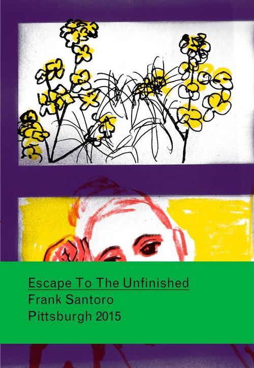
On The Comics Beat Phillipe Leblanc reviews Frank Santoro’s Escape To The Unfinished #2 (Breakdown Press, 2015).
“The key to understanding Frank Santoro’s work in Escape to the Unfinished #2 lies in the feelings memories evoke. A river running under a multi-span bridge, a silhouette standing at the end of a hiking trail in the woods, an industrial building surrounded by overgrown vegetation. All of these anchored by the recurring image of a woman. She’s on the cover of the book, and throughout multiple panels in the comic, always looking directly at the reader. The whole comic is framed on fragments of memories. It’s mostly silent, with a single exchange between two characters in the whole comic. … By simply presenting scenery and tying it to the memory of a loved one, Santoro manages to create feelings of sorrow and heartache.“
—————————————————————————————————
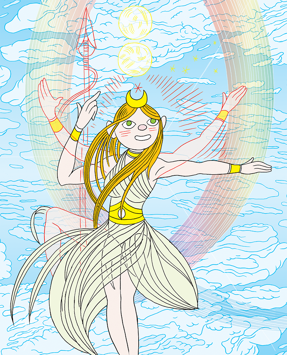
What Parsifal Saw is the latest comic from Ron Regé Jr. (Fantagraphics, 2017). It collects Regé’s work since The Cartoon Utopia (which was just released in a new softcover edition.) Bill Boichel writes about What Parsifal Saw:
“The two key pieces here are “Cosmogenesis,” illustrating the “secret doctrine” of Madame Helena Blavatsky, the key figure in the history of Theosophy (which had a significant influence on the first generation of modernist artists, notably Piet Mondrian and Wassily Kandinsky), and “Diana,” Regé’s unique spin on W*nder W*man…Ron Regé, Jr. has been striving conscientiously to forge a visual language to channel spiritual forces through comics, continuously evolving his approach, and in the process creating a singular and highly rewarding body of work.“
Get a copy of the book HERE.

In January Ron Rege Jr. spoke to The Creators Project on VICE about his work, and explained how he uses the simplicity of drawing to explore and impart hidden, sacred knowledge. The Cartoon Utopia (originally published in 2012) documents a large part of that journey, and What Parsifal Saw continues it.
” “In a spiritual sense, my ideas always seem to focus on some sort of attempt to explain the unexplainable,” Regé says. “I’ve always been trying to look through the mirror, so to speak. Experiences like deja-vu, lucid dreaming, and a sense of reincarnation are things I’ve always felt in my heart. I’ve never been able to really understand how or why we live in these cultures and societies that are so disconnected from the earth and our true selves. I’ve never sensed that things like rules or money are anything other than made-up illusions. I’m always looking for that eternal DMT moment in the back of my dreams where I came from. These things shaped my life and my work, and I seem to always be becoming more aware of what it all is.” “
Read the rest of the feature on VICE‘s The Creators Project. Get a copy of The Cartoon Utopia HERE.
—————————————————————————————————
I enjoyed this short documentary from 2000 about Ben Katchor and his comic strip Julius Knipl, Real-Estate Photographer. Katchor guides the viewer through a grey landscape of jumbled skyscrapers and lonely warehouses, commenting on the funny names of stores and the pleasant nostalgia of functioning ruins. His love for walking the city inspired him to make a cartoon character who did the same thing, and week after week he found something to put in his strip that came directly from standing on the street himself.
“You see the city in terms of your bodies ability to move around it. Every inch of pavement is a whole world of activity. When they remake a sidewalk you really feel like something has been ripped up, some artifact, some record of all the people who have passed over it.“
Calling himself a “middle-man in the memory business“, and comic strips a “low-level commodity“, Katchor still recognizes that everything has a story if you know how to look for it, and with a shrug and a smile, says “Once in awhile in a strip you’ll see this crack in the facade of everything – of the commercial world. There’s some great dramatic moment of revelation.”
—————————————————————————————————
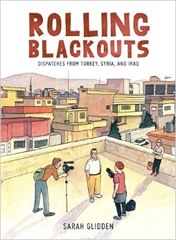
As the comics award season begins, Michael Cavna, of “Comic Riffs” on The Washington Post, offers his list of comics that ought to win an “Oscar”. He fears worthy comics such as Rolling Blackouts by Sarah Glidden (above), Patience by Dan Clowes, and Mooncop by Tom Gould may be overlooked – plus 7 others – so as you make convention and award ceremony rounds this year, perhaps you will be inspired to put your vote in for some of his picks – the rest are HERE.
—————————————————————————————————
The paintings above recently moved from Brian Chippendale’s studio to Safe Gallery in Brooklyn, NY, where they join an instillation by Greek artist Ioanna Pantazopoulou. The gallery writes about Brian’s show:
“Brian Chippendale’s airy new paintings unveil a secret inner world assembled from raw drawing, scrawled notes, and compulsive doodles. By shedding the density of his past work, Chippendale trades out his heavily-populated collages for visually lighter canvases. The artist’s characteristic rainbow-hued palette remains at play as he edits out the layered space with white to carve out a new arena for expression. In some moments Chippendale actually makes punctured shapes through his surfaces as an alternate layer of mark-making. The laminated surfaces serve as the backbone of the paintings while bursts of marks hover in space. The drippy color-drenched squiggles, sprayed like fragments of graffiti, serve as futuristic hieroglyphics with buoyant and vibrant results.“
More about the show HERE. More work by Brian Chippendale can be seen HERE.
—————————————————————————————————
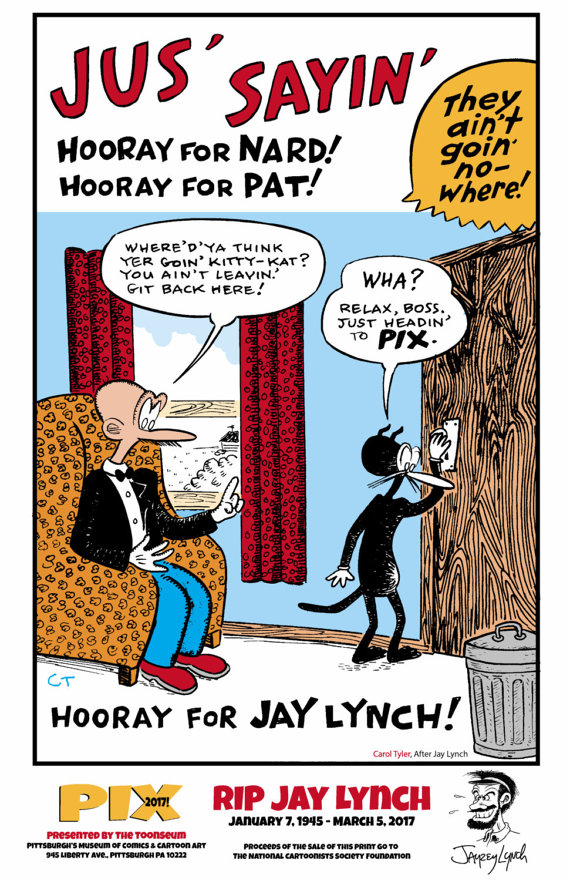
Get a limited edition 4-color silk screen printed version of the 2017 PIX poster (above) made by Carol Tyler in honor of Jay Lynch.
“The 11″ x 17″ print featured a 4 color silk screened image of Jay’s most famous characters, Nard n’ Pat as drawn by cartoonist Carol Tyler in a limited edition of 50, signed by Carol Tyler. Proceeds from the sale of this fine art print will benefit the National Cartoonists Society Foundation, which provides financial assistance to cartoonists and their families in times of hardship.“
—————————————————————————————————
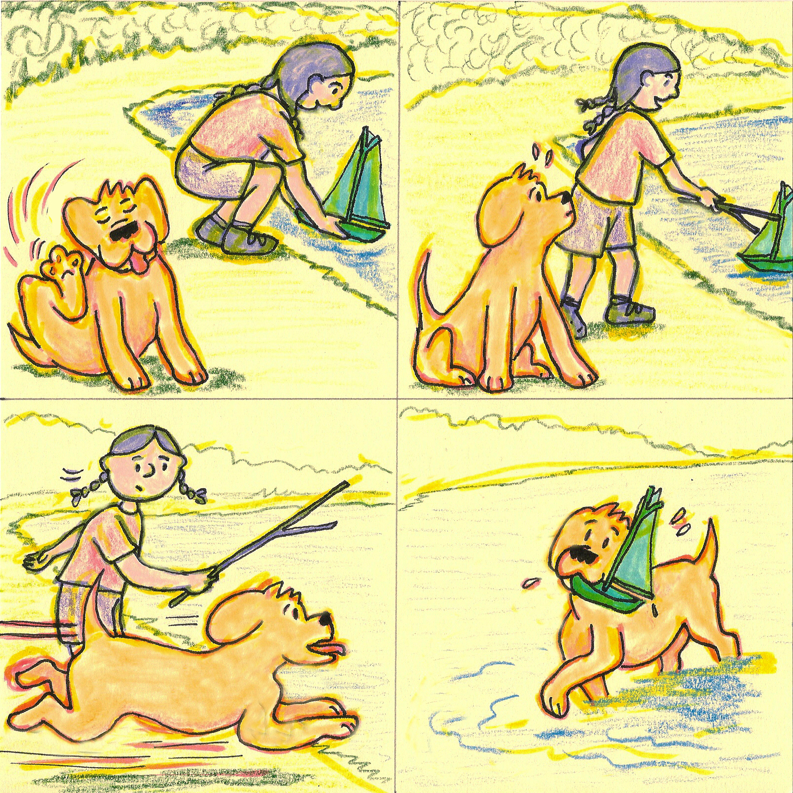
Blinkers – 3-27-2017 – by Jack Brougham
—————————————————————————————————
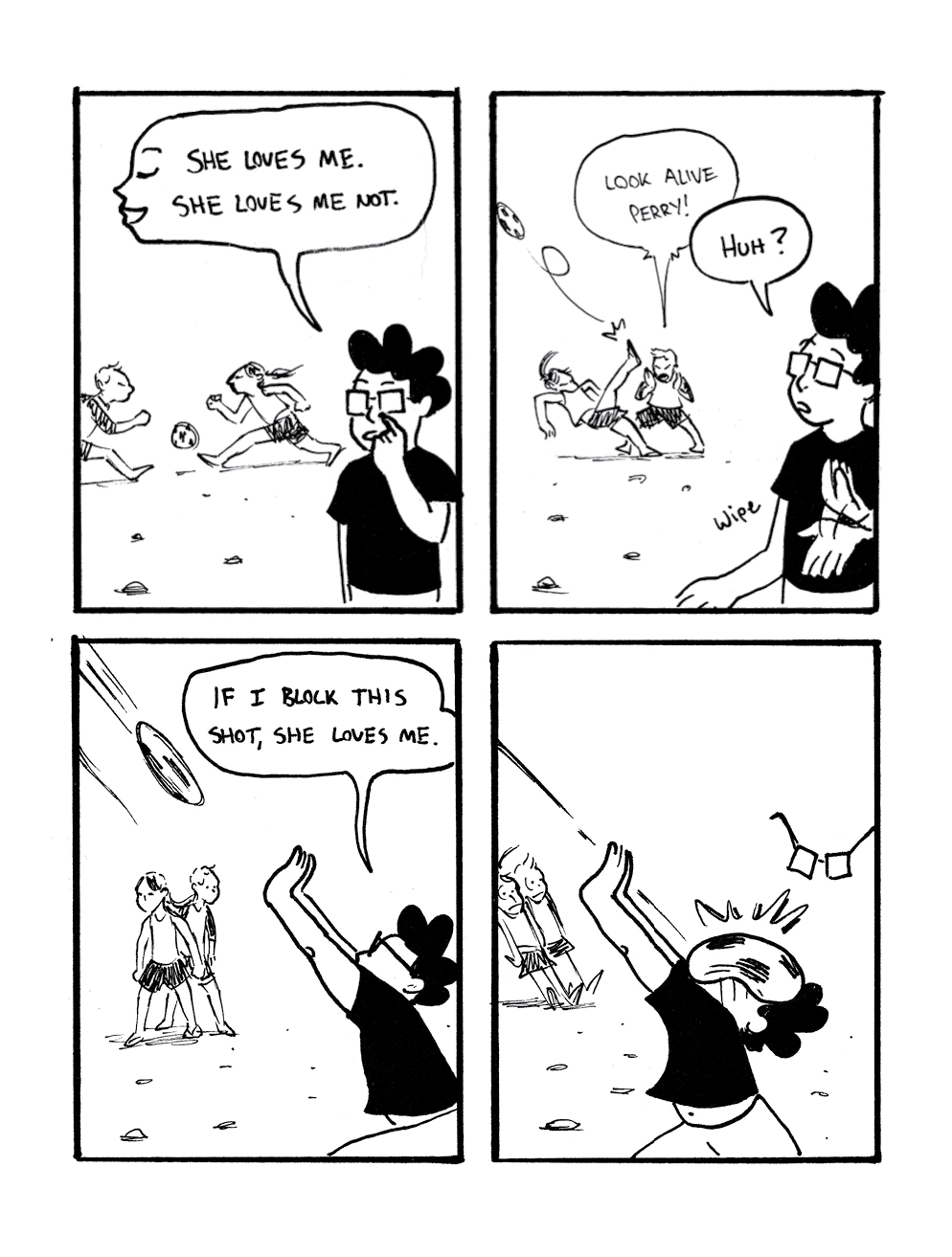
Suzy and Cecil – 3-27-2017 – by Sally Ingraham
—————————————————————————————————
Joanie and Jordie – 3-27-2017 – by Caleb Orecchio
