Caleb Orecchio here with thoughts on Alyssa Berg’s risograph comics. PLUS! some insight into Alyssa’s process from the author herself!—and other news.
—————————————————————————————————
I think Alyssa Berg’s current work is a step in the right direction for a modern day cartoonist—being an exploration in printing, risograph specifically, and how that process can present her comics in the best way a riso machine can.
Alyssa makes painted comics that live online as photographs of the actual paintings, then “adapts” the paintings into risograph printed comics—the latter being slightly different than the former naturally due to how a painting transfers to this particular printing process. As a cartoonist, I can literally see her “thinking” when comparing the “actual” versions with the riso versions. Looking at her two versions of Alpenglow (winner of the 2015 Comics Workbook Composition Competition) I’m fascinated at the choices Alyssa made when “adapting” the paintings to print.
At CXC 2016 I bought her first printing of Alpenglow, which was digitally printed. At SPX 2017, I bought the second printing, which is adapted to riso. Look at the differences below.
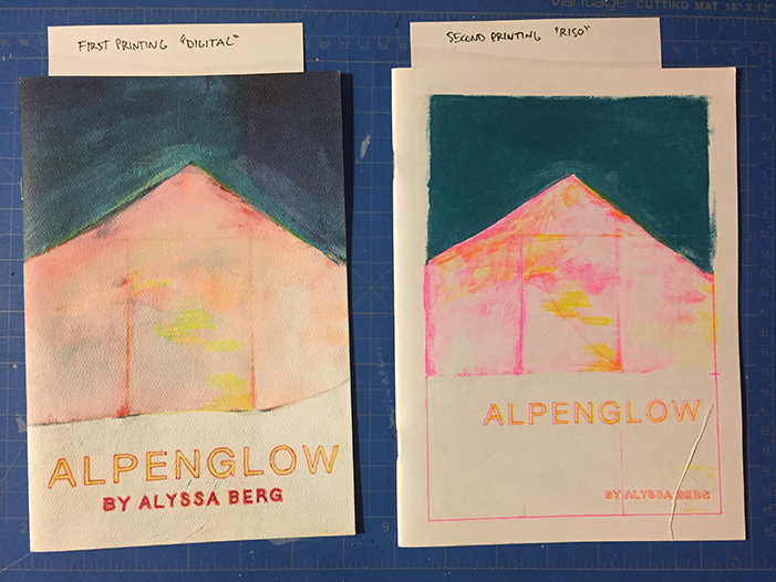
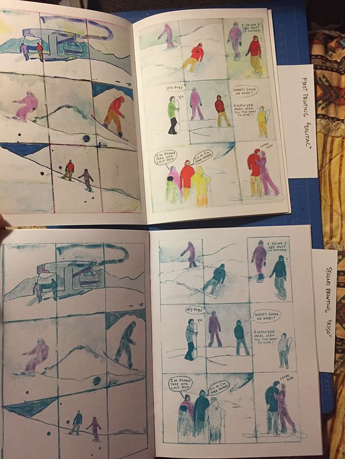
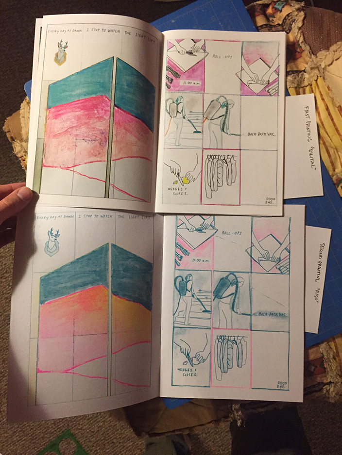
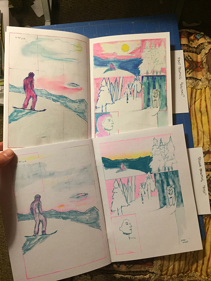
The differences are interesting because both versions are good, obviously, but I find the riso version to be particularly intimate. Her paintings are beautiful, and I miss seeing the brush strokes and nuance of color the digital version provides, but the way the riso strips everything down really sings for me. For one, riso just flat out looks better than digital. Anything looks better than digital really. Second, the choices Alyssa makes are in service to the clarity of the image while also retaining the spirit of the painting (which we’ll get to in a second in Alyssa’s own words). This pruning of the work through the filter of riso really circumnavigates any distractions (though they are enjoyable) the paintings provide, and allow the reader a wholly immersive comics reading experience.
I should be clear, I don’t necessarily think the painted version is better than the riso version, or vice versa; but it’s the fact that these very excellent comics exist in different ways is what is exciting to me.
I asked Alyssa to give some brief insight into her process of adapting paintings to riso prints, and this is how she responded:
“I started printing my painted comics last winter at the SVA RisoLab. I had this short-lived fantasy that I would be able to use a simple CMYK color separation in Photoshop to make faux-CMYK prints on the Riso. I realized quickly that while certain prints looked okay using this method, most of them came out with too much visual information/noise because of the texture & subtlety of the color mixing in the paint combined with the imperfect registration of the Riso. Also, registering the text with this method is not ideal.
“Over the summer and currently during my residency at the RisoLab, I’ve been experimenting with ways to keep the integrity of the painting in the reproduction. I use a mix of “CMYK” in certain areas, spot colors with texture layers on top in other areas, and other spot colors without any mixing. This method reduces the noise and keeps the print painterly. The text is almost always one color so it’s crisp and clear. All of my color separation is done [manually] in Photoshop. I’m not much of a technology-person so there has been a big learning curve. By now doing color separation has become pretty intuitive, but still, I’m not always sure what the outcome will be. I like that little surprise. I rarely look at Riso color mixing charts/percentages. I rely on my knowledge of color mixing and grayscale from my painting background. I tried once to design a specific zine for the risograph & it came out kind of boring. It required too much thought while I was painting the pages and I prefer to not think in this phase! For now, I’m happier painting freely then putting in the hours on Photoshop.”
Thanks Alyssa! If you want to pick up her comics, Alyssa will be at Comics Arts Brooklyn this weekend at Table K6.
As a cartoonist, there’s a lot to learn from watching Alyssa transform her work for print. I highly, highly recommend seeking her books out, and compare the books to the paintings; she has most of them up on her site.
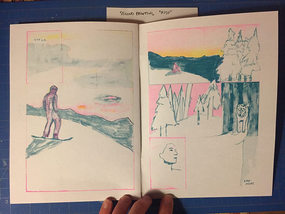
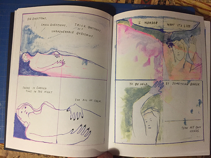
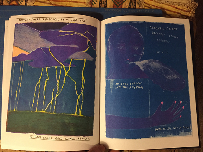
I leave you with some pages from my favorite Alyssa Berg comic, Open Letter to Sleep.
-CO
—————————————————————————————————
if you don’t know, now you know
- Ron Wimberly and Beehive Books launched a Kickstarter for a newspaper magazine, LAAB Magazine.
- Two IDW imprints, The Library of American Comics and Euro Comics, have a podcast together.
- Tessa Strain reviews Garth Ennis and Goran Parlov’s follow up to their very popular and well-recieved Nick Fury comic. This time, it’s the Punisher.
- Not a link, but word around the campfire is Robin McConnell will be interviewing Chris Ware on occasion of his epic Monograph book for an upcoming episode of Inkstuds. So stay tuned.
- In other news, the latest Inkstuds episode features an interview with Cecil Castellucci and Marley Zarcone, the driving force behind a mainstream comic I like, Shade the Changing Girl.
—————————————————————————————————
Suzy and Cecil – 11-6-2017 – by Gabrielle Tito
—————————————————————————————————
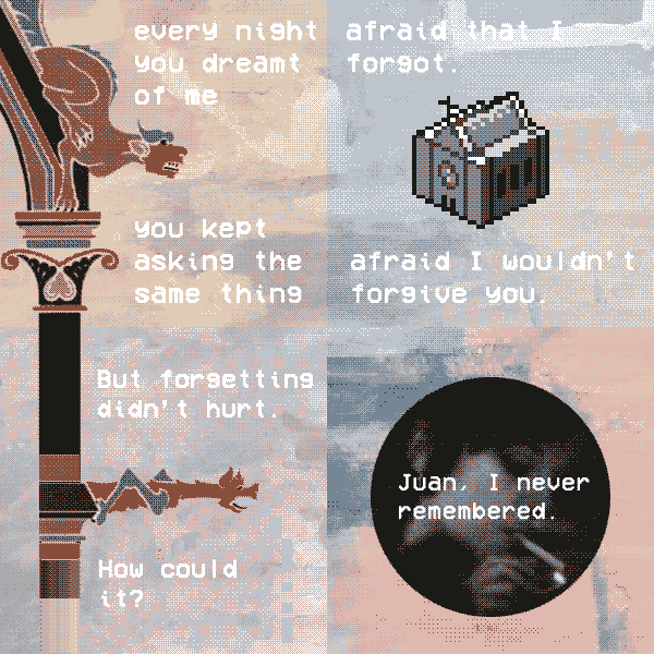
Cozytown – 11-6-2017 – by Juan Fernandez
—————————————————————————————————
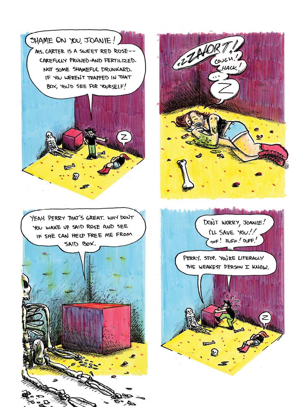
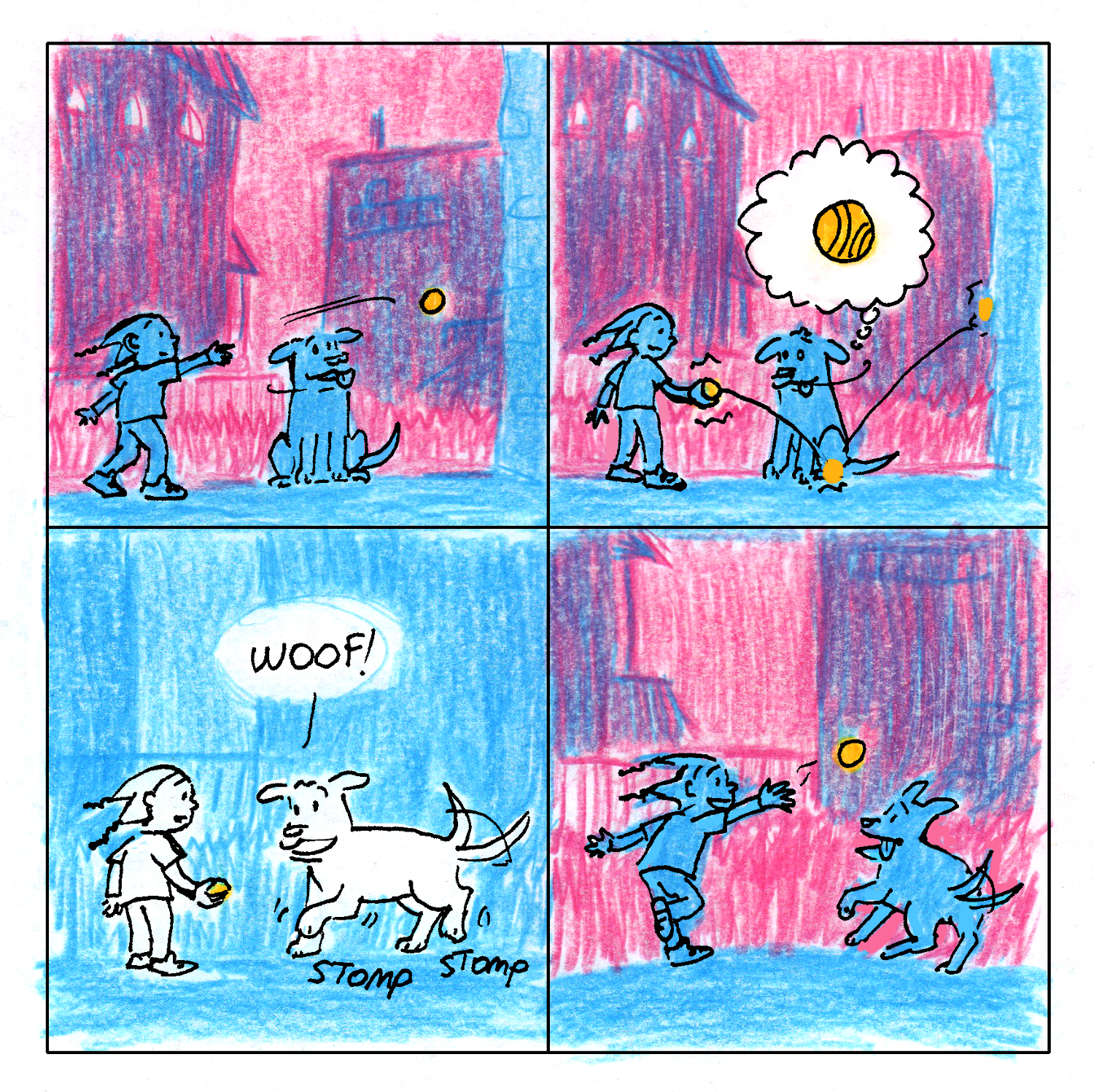
Joanie and Jordie – 11-6-2017 – by Caleb Orecchio
—————————————————————————————————