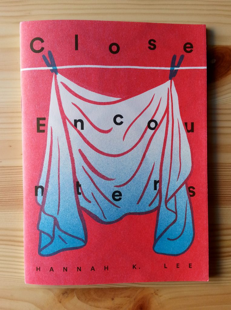
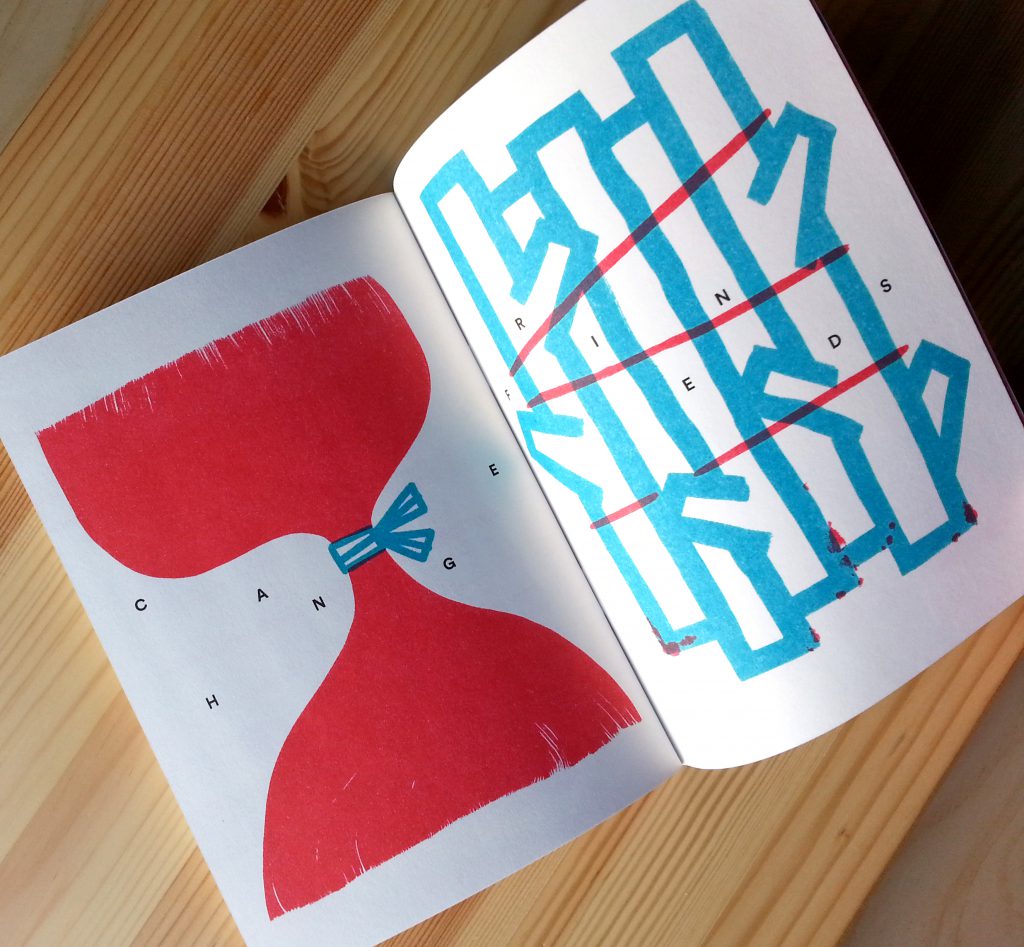
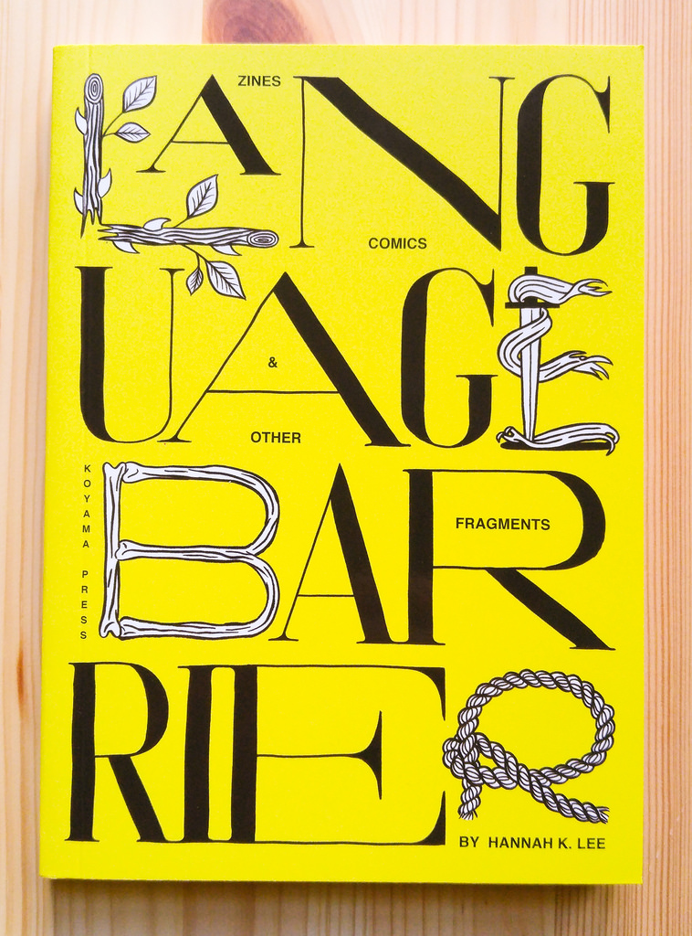
 Recently nominated in the 2018 Ignatz Awards Outstanding Collection category for her book Language Barrier, congrats to Hannah K. Lee! Here is an interview conducted before Language Barrier was announced as a Koyama Press publication, which is content gathered from Lee’s zines Issues and Close Encounters along with new work, exclusive to the book. A couple of years ago, I first discovered this work through these zines as well as in commercial periodicals like The Pitchfork Review. I view lee’s illustrations not only like cartooning/comics but also influenced by graphic design/iconography and typography. Her work begins from these disciplines but becomes more and ultimately something unique after.
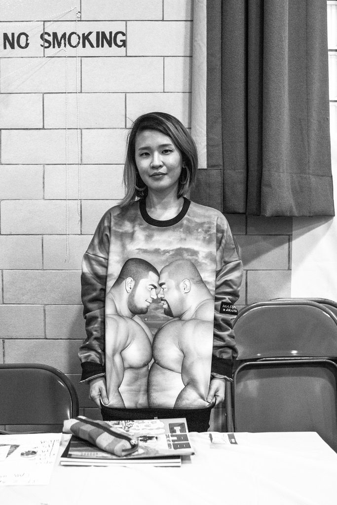
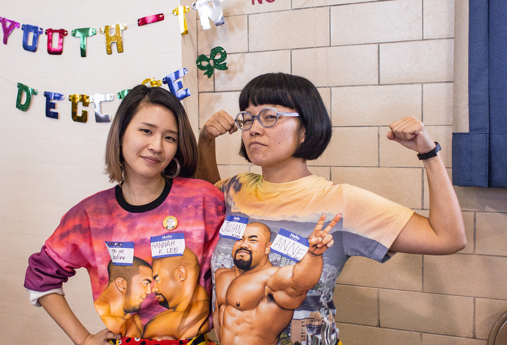
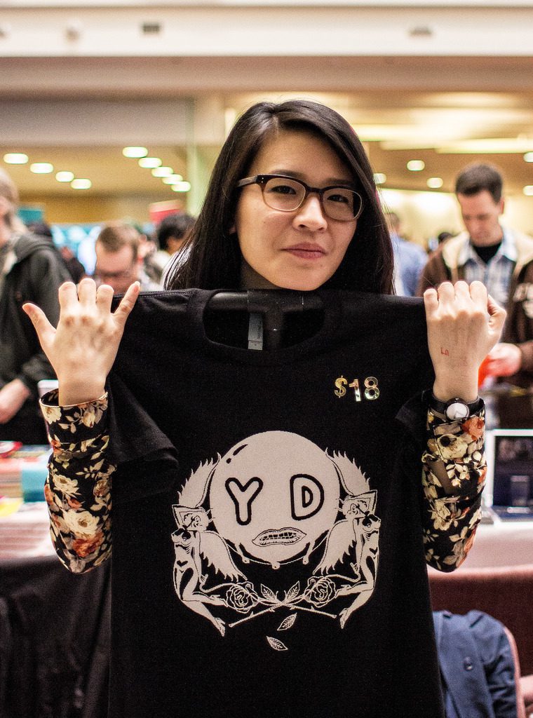
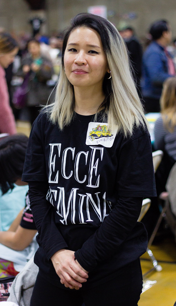
Special thanks to Hannah K. Lee for her time doing this interview and providing earlier drafts of her Issues sketches for #2 and #3, offering further insight visually into her process. Graham Willcox color finished the three photos of Lee below, taken at CAB 2015 and TCAF 2014.


Annie Ishii (right)
This interview was conducted in 2015 via email.
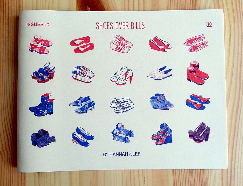
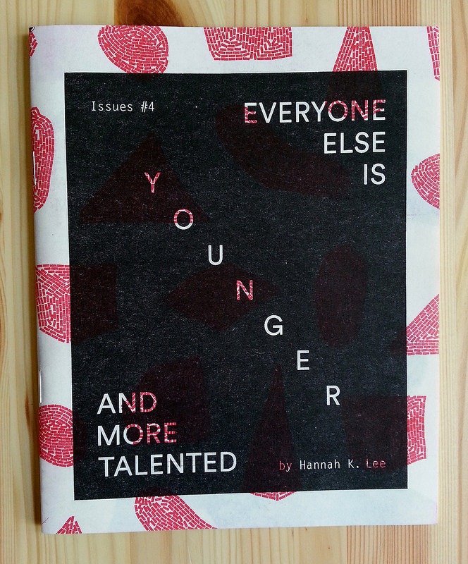
Chris Anthony Diaz: In Shoes Over Bills no. 2, there’s a dichotomy in the page layout of materialism and desires (shoes) on the left side of the two-page spread and monthly obligations and needs (bills) on the right side of the spread, rendered in your colorful, stylized, retro graphics and typography. It’s a potent expression of what choices a young woman faces, enticed by beauty to spend her earnings on. Like two sides of a debate, one side wooing her to buy gratification in possessions or the other side pitching her to commit to practicality, like eating. How did this zine come about for you and what was the original impetus of this theme? (The dichotomy appears again in Everyone Else Is Younger And More Talented, so it appears to be a theme or expression that you are concerned with.)
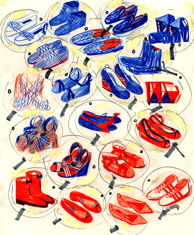
Hannah K. Lee: Issues #2: Shoes over Bills was first a smaller chapter of a bigger project I wanted to do called No Money Mo Problems, A “lifestyle guide for impoverished freelancers”. A lot of those ideas were stupid, so I extracted Shoes over Bills and made it its own project. I started it right before I started my corporate day job, when I was learning about boring adult things like money management and regular visits to the dentist.
(This is a sketch for Shoes over Bills, before it was a zine)
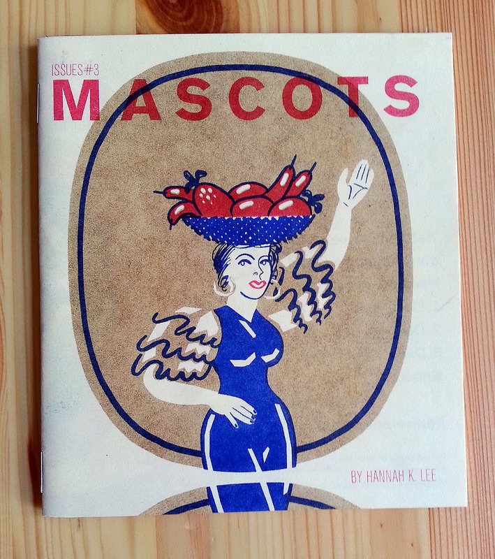
CAD: What attracts you to product graphic iconography, which is the theme in Mascots no. 3? and please speak a little how it manifests its expression in your graphic illustration, which appears to have a graphic influence of russian constructivism.
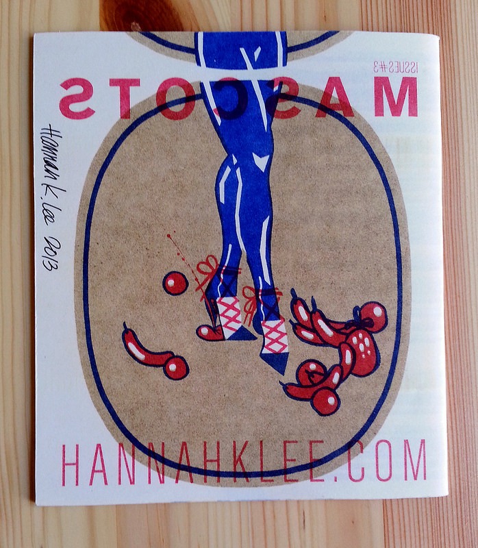
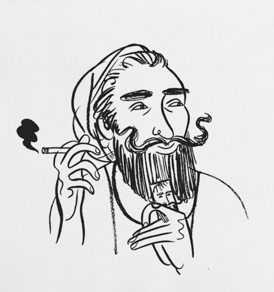
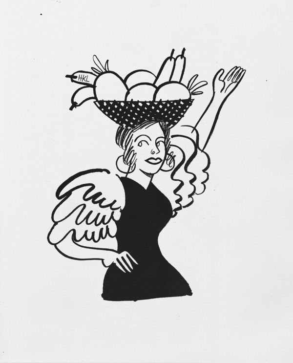
HKL: Issues #3: Mascots first came about when I drew portraits of the Zig Zag man and the Chiquita Banana girl. I made the rest of Mascots with the risograph and overprint techniques in mind, which went well with the limited color palettes often seen in product iconography.
Any kind of restriction will force you to find ways to say more with less. When it comes to working with a riso, the color choices are limited and the threshold for showing details is low. As a result, it seems that my work has been becoming more graphic as I exercise more restraint.
CAD: How do you come up with merging the ordinary and familiar with the fantastic and surreal in your illustration?
HKL: I studied Illustration in school, and we were trained to look for analogs and ideas in weird places to convey a concept, while trying to stay away from cliches. Every project I start begins with words, and then I write down everything that comes to mind that relates to those words. My sketchbook is actually 90% written gibberish that only makes sense to me, instead of thumbnails and doodles.
CAD: Color (especially red appears consistently and predominately in your risograph publications) and typography are strong facets of your graphic imagery. Where do you find your inspiration and what do you look at regularly?
HKL: Besides the work of other working illustrators, designers, and letterers, I like looking at packaging (fruit boxes and crates, foreign candy), flags, old and ornate rugs/textiles, pop music ephemera, Tumblr teens, fashion, clever logos, bad logos, old calligraphy, illuminated manuscripts, those kids’ Golden Books, I like to absorb and/or pick apart everything.
When it comes to certain jobs that require a lot of research, I look at the design and illustration of that particular era and let that inform how it’ll turn out. For example, I just did a piece about the origins of ska, so I looked at a lot of 60’s album art coming out of Kingston.
CAD: How has risograph printing affected your published output in these three publications: Mascots and Shoes Over Bills and Everyone Else Is Younger And More Talented?
HKL: Someone told me once that if I make something to sell or to promote myself with, it’d better be something the recipient would want to keep. So with that in mind, it should be useful, meaningful, beautiful, or at least 2 of those.
I like working with the risograph because it’s an efficient and cost-effective way to make your zine beautiful. There’s a resurgence going on in zine culture that’s very much about thematic or narrative self-expression and considered presentation. Despite my recent output though, I actually don’t think it’s always necessary to make your zine pretty! With a good idea or story, sometimes a xerox is all you need.
 Recently nominated in the 2018 Ignatz Awards Outstanding Collection category for her book Language Barrier, congrats to Hannah K. Lee! Here is an interview conducted before Language Barrier was announced as a Koyama Press publication, which is content gathered from Lee’s zines Issues and Close Encounters along with new work, exclusive to the book. A couple of years ago, I first discovered this work through these zines as well as in commercial periodicals like The Pitchfork Review. I view lee’s illustrations not only like cartooning/comics but also influenced by graphic design/iconography and typography. Her work begins from these disciplines but becomes more and ultimately something unique after.