Juan FernándezJuly 11, 2016NewsJuan Fernandez here with: Alyssa Berg’s ALPENGLOW; the passing of Geneviève Elverum; Katie Skelly on “women in comics”; Spurgeon and Boichel on the state of the industry; An Afternoon with Steven Gilbert; Jim Rugg on digesting How to Draw the Marvel; a new auction to benefit the Rowhouse Residency.
—————————————————————————————————
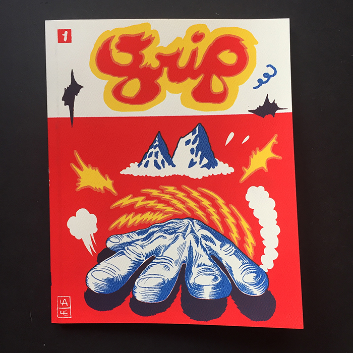
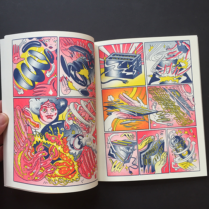
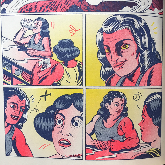
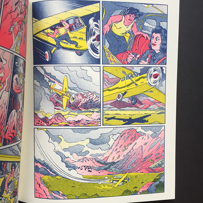
Alpenglow – Alyssa Berg
I’m happy to announce that we are featuring Alyssa Berg‘s Alpenglow on the site this week. Alpenglow was made in 2015 for the 2015 Comics Workbook Composition Competition. It came in 1st place in that year’s composition competition.
—————————————————————————————————
Geneviève Elverum, RIP
After being diagnosed with stage 4 pancreatic cancer last spring, Geneviève Elverum has passed away. She was 35 years old.
(via exclaim.ca)
On his GoFundMe page, Phil Elverum shared the following heartbreaking message:
Geneviève died today at 1pm.
She was truly driven to work and stay living right up to the last minute, insisting on getting up and going to work in her studio way beyond when many would have surrendered to rest.
Last night and this morning she declined quickly and receded into her own eyes as her body vetoed her wishes, her lungs filling with fluid. She died at home with me and her parents holding her, hopefully having reached some last minute peace.
It’s all very sad and surreal. So much is left unfinished for her. She was a firehose of brilliant ideas that never turned off.
We loved her and everything is weird now.
Thank you for all the money, all the support and love.
Phil
Remembering Geneviève:
Geneviève Elverum interview by Tom Spurgeon (2012)
Geneviève Elverum interview by Naomi Fry on TCJ (2013)
A memory with Elverum via Gabrielle Bell’s diary last night
The gofundme for the late Geneviéve Elverum to help her surviving family defray medical expenses.
—————————————————————————————————
Katie Skelly talks Craft, the medium and Erotic Comics
Kristen Korvette interviews Katie Skelly over on Slutist.
How tired are you of talking about “women in comics?” Can the conversation move on to something more nuanced/complex or in your opinion is it still a necessity to highlight the gender disparity in your field?
I’m so tired that I could be medically dead. It’s historically and culturally ignorant; like, if you don’t know who Marie Severin is and why she’s important, you don’t fucking know comics. Period. To act like women in comics are new and haven’t existed this entire time is bizarre. But I don’t know if comics is ready for a larger conversation because it’s been stalled in the same gear since the ‘60s. I want to see a woman be heralded as a “master of the medium” with the ease Daniel Clowes or Frank Miller are, which is a way that isn’t questioned. Men are masters; women are gifted, or agile in the medium, or whatever… like it’s always coded as a surprise. I think that takes giving more room to non-white guy comics critics, which I do see happening, but it’s very slow.
—————————————————————————————————
More comic books than ever. However…
Really interesting comments by Tom Spurgeon on the nature of what kinds of comics are being promoted and consumed most heavily over on Comics Reporter.
Tom Spurgeon: One of the reasons I think no one trusts critical discourse in comics right now is because that specific point of view on things is so decidedly inarticulate. It was easy in the 1980s to point out how RAW was better than Marvel Two-In-One (yes, even the Project Pegasus run); it’s harder to make the distinctions we’re asked to make now. A solution you often see, where the critic dons the skin of Greg Cwiklik Buffalo Bill-style, sets an even higher bar and destroys the better-crafted work as just another piece of meretricious disposable fluff like it’s 1992 again, that may thrill the hardcore art crowd but wins few minds. In many hands that kind of rhetoric feels just as convenient as those end-of-the-year lists that have a book from every important publisher. It’s not that people need to adjust their standards, but discuss intelligently the ones they have. I get the sense that a lot of people with their end of year lists could swap out another dozen comics for the ones they selected and be perfectly happy writing either article. Don’t get me wrong: I’m public enemy number one here. I barely even write about comics anymore.
I was curious as to what this all meant coming from Spurgeon, so I asked Bill Boichel over at Copacetic Comics what his thoughts on Spurgeon’s comments were.
Bill Boichel: The books chosen in the lists that Tom references are simply indicative of the broadening and shifting of the variety, options and tastes now on offer in entertainment comics. These books are simply the Archie, Richie Rich, Dennis the Menace, Spider-Man, Fantastic Four, Superman, Batman, Tarzan, Donald Duck, Uncle Scrooge, Bugs Bunny, etc. of today: a variety of entertainment for different tastes and interests whose primary motive is being successful: generating sales and profits, revenue for the publishers and income for their creators but which nevertheless occasionally, through some particular confluence of personal and historical factors, produce works of lasting genius. They are in an entirely different category from comics produced under the aegis of personal motivation, that are consciously created with of artistic and literary ambition, and the goal of which is personal expression, education and illumination of readers, preserving historic and cultural perspectives that are under-represented and/or at risk of being lost, et al, and in which revenue and income are secondary concerns.
This distinction of course cuts across all forms, and is certainly not limited to comics, which in fact has only relatively recently reached the point in its development as a form to avail itself of this distinction.
—————————————————————————————————
An Afternoon with Steven Gilbert
Gabriele Fazio provides an extensive career spanning interview with Steven Gilbert over on Just Indie Comics.
Between Gardenback and The Cult of Gardenback you published the first issue of Colville, right? It should be from 1997…
Yes, in the beginning it should have been much smaller, like 25 pages, and it had to be only about the confrontation in the schoolyard. It was loosely based on a true crime story, I clipped the newspaper article when it was happening because I remember reading it and thinking “It could be an interesting comic”. But those were just the bare bones, the story began to grow around the episode of the shooting in the schoolyard. I thought to do a 64-pages comic and I had the bones of the story and a lot of the imagery was in my head. I went up to Keswick, a small town 20 minutes up the highway from Newmarket where the facts actually occurred. My friend Jason Williams lived there, so he knew all the neighborhoods. We drove there one day and took photo references I used for the comic.
Do you use a lot of photo references, right?
Yes, these researches are part of my methodology, because I don’t write scripts…
Never?
I tried but I never successfully wrote one, when I finish and read a traditional script with panel descriptions, dialogues and so on, usually the ideas just seem stupid and I can’t use them. The only way I can make comics is to sit down and draw. My process of writing is the creation of the comic.
—————————————————————————————————
Jim Rugg on digesting How to Draw the Marvel Way
Recently, I found a copy of How To Draw Comics the Marvel Way at a local garage sale for a quarter. I had a copy of this book when I was a kid. I found it within a week of declaring my intent to be a comic book artist. In middle school, I lent it to someone who never returned it. My tastes and influences had changed so I never replaced it.
Since then, I’ve referenced it in a ballpoint, notebook drawing (mashing it up with Rob Liefeld’s 90s Xtreme Studio style)…
—————————————————————————————————
New Private Rowhouse Auction – 7.10-7.14
Last but not least, we have a new private auction up at auction.comicsworkbook.com! Lots of old and new comics for you to take home. email Frank Santoro at santoroschoolATgmail for a password, if you don’t already have one. If you already have a password, it is the same from last week. All funds go to helping keep the lights on and further developing the school. Connor Willumsen is offering commission sketches that you don’t want to miss out on, all at different tiers. Don’t sleep on your chance to get work by this contemporary heavy hitter.
—————————————————————————————————
take care of yourselves <3
Juan
Share this page: [...]
Looks bloody great!!!