Bryce Davidson here with a look at “The Illustrated Salaryman In Japan” and infographic comics.
—————————————————————————————————
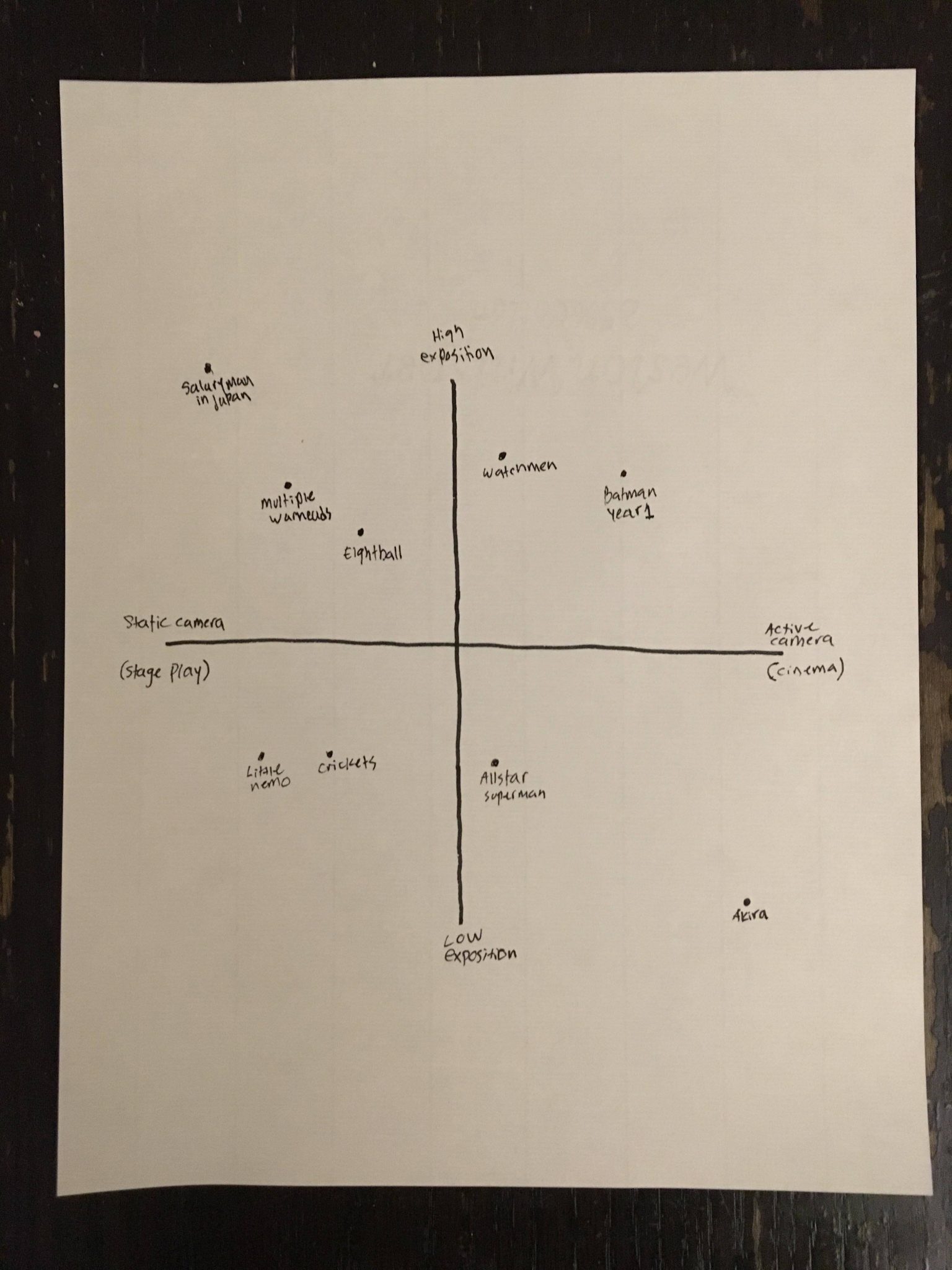
Bryce Davidson here: Comics are a diverse medium. It’s one of its many perks. Words and images right? The stage on which comics perform varies drastically within them. Most modern mainstream comics ape a cinematic feel. Mainly dialogue driven stories (usually a lack of exposition or prose) with consistent art and setting, which uses framing, light and angles to alter mood or tone. An obvious choice, very accessible to most people, and usually effective.
In contrast, many older and independent comics use more consistent angles and shots, with more exposition and a lenient use of cartooning symbols, I.E. sound effects, accent lines, and cartoonish exaggeration to alter tone, and mood. This method, while being exclusively “comics”, also can feel dated or difficult to read for many modern readers. I often hear people complaining about too much exposition (I never seemed to mind it too much).
There is a third method, which is the one I wanted to focus on for this article: Infographics.
Up until recently (honestly, Brandon Graham [and Dan Zettwoch – editor] are probably the best current examples) info graphics never really got the treatment they deserve. These comics are completely exposition driven – if there is a word balloon it’s usually a single word to accent the drawing or sound effects. You can cram a tremendous amount of story into an incredibly small page count. This differs from cinematic comics a lot. It is incredibly clear story telling with little to intemperate. On the flip side it is rigid and not very juicy storytelling.
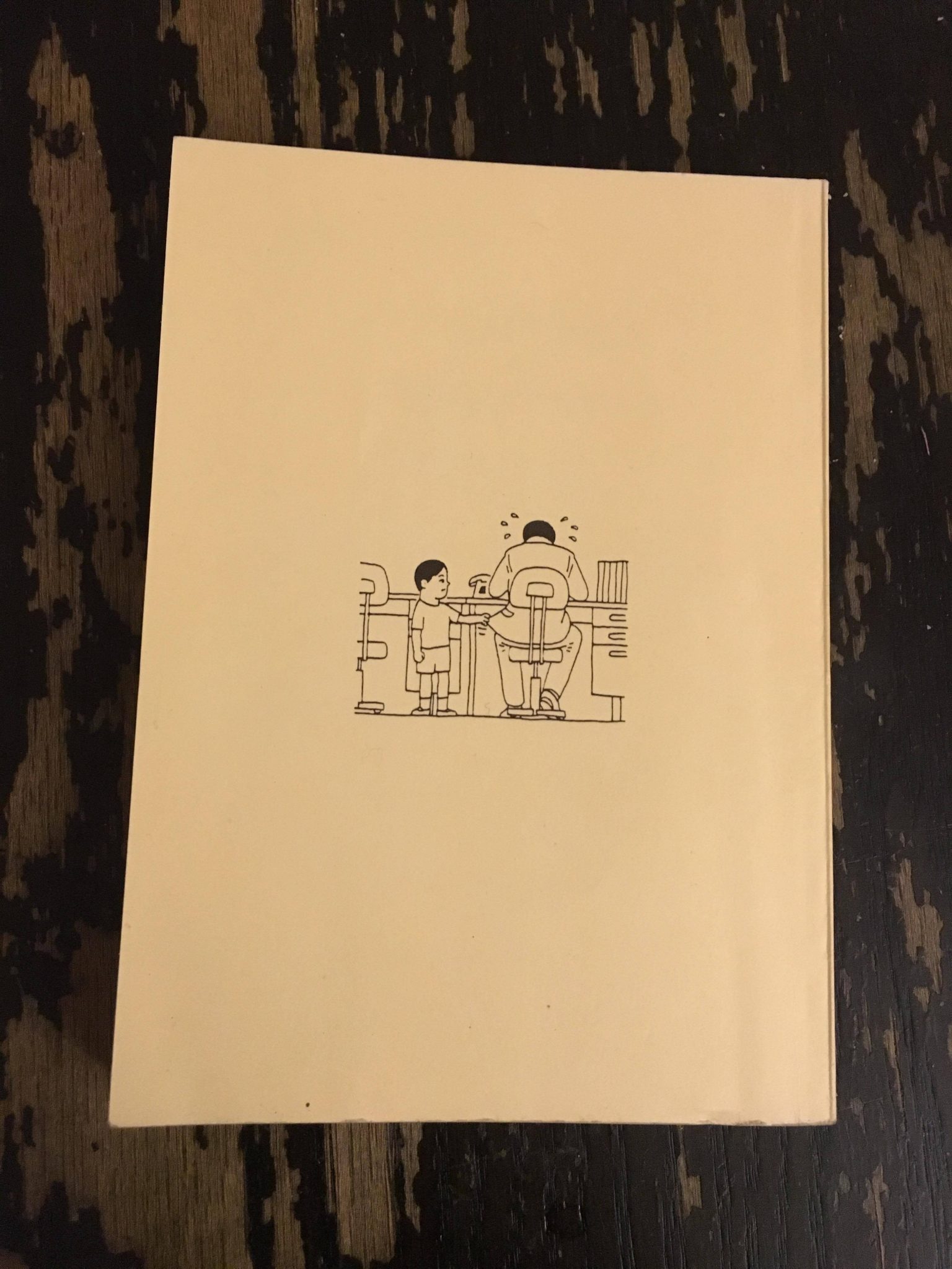
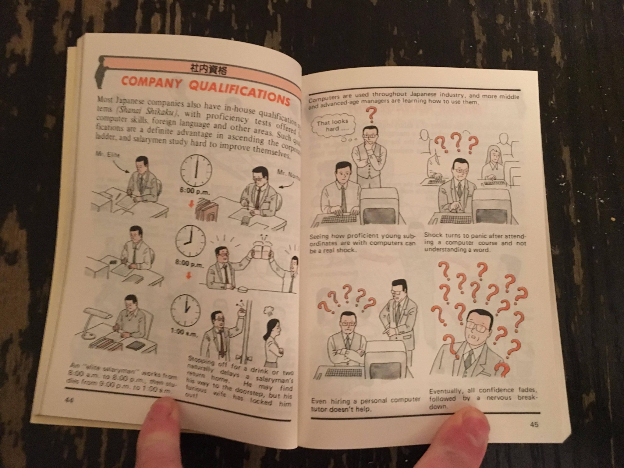
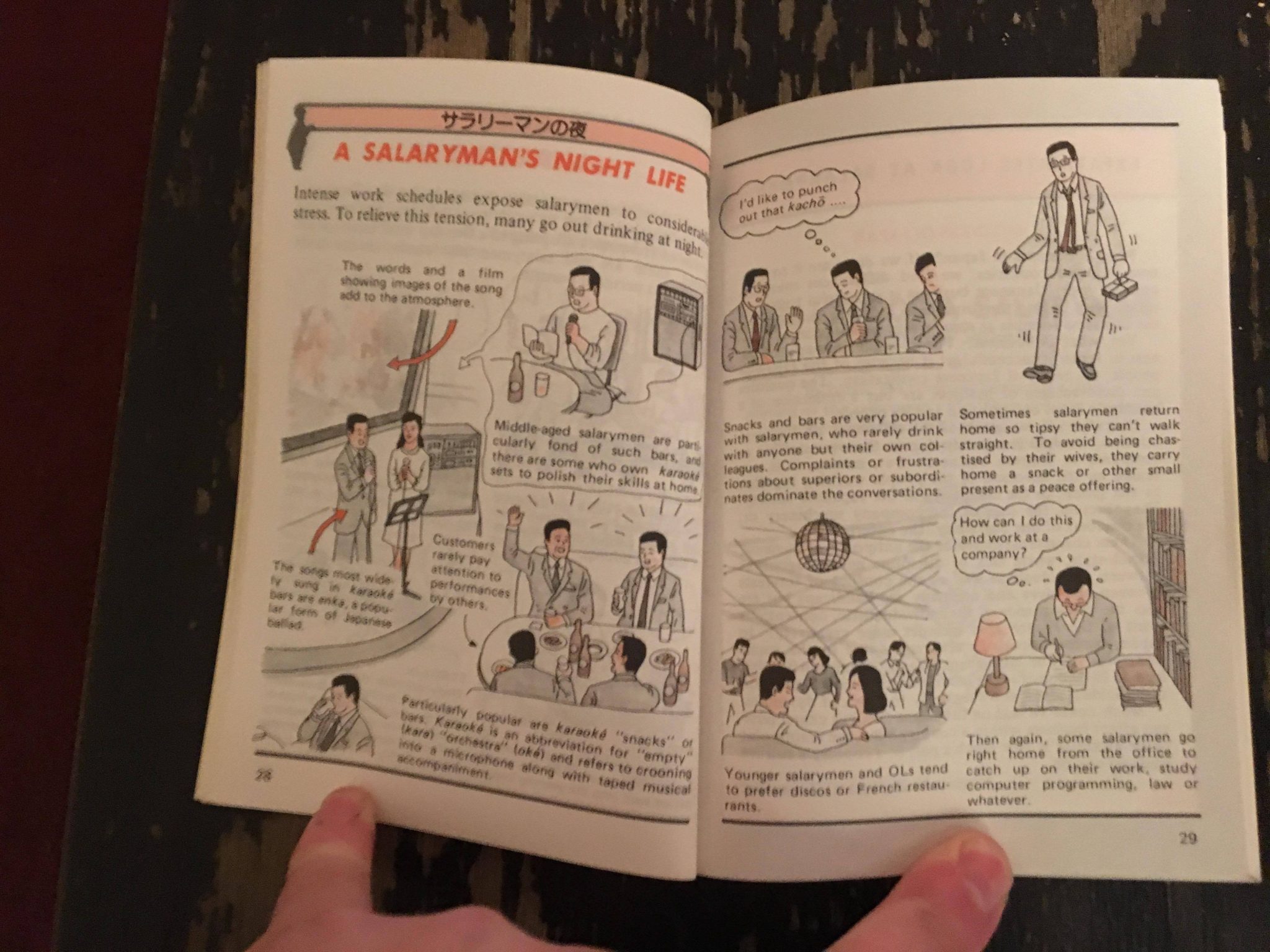
This brings me to an interesting book I found a few years back at a library book sale. Titled Illustrated Salaryman in Japan, it is part of a series of book which were commissioned by the Japanese Travel Bureau in the 80’s to market to business people as pocket guides to Japan. The volumes cover most topics of modern day life but this one in particular is about the salaryman culture of 1980’s Japan.
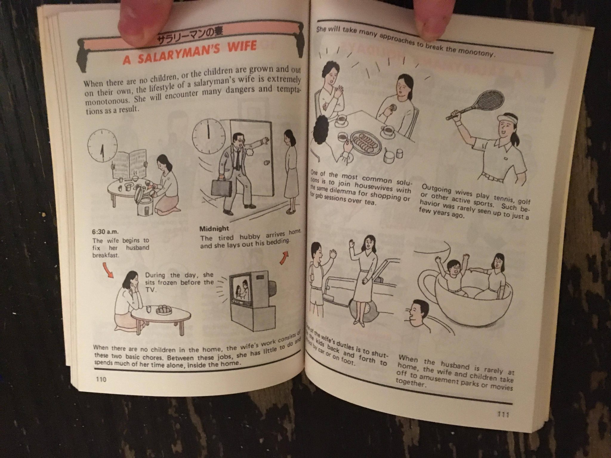
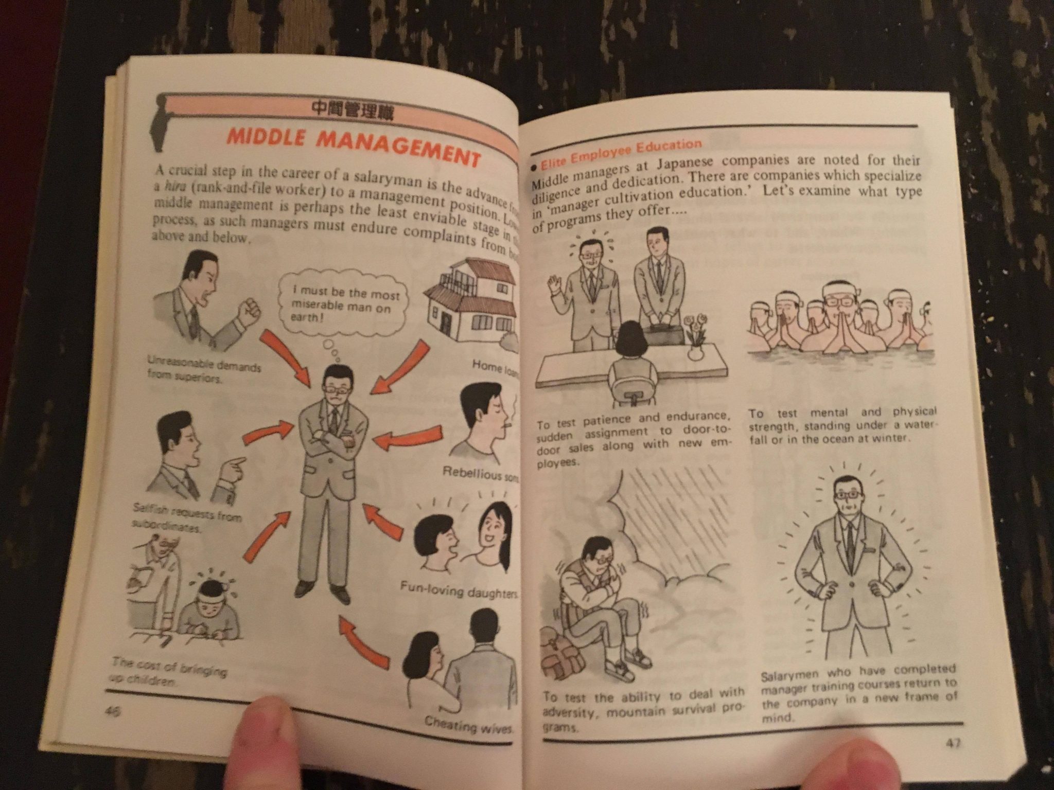
It has no credited artist as far as I can tell and all info online credits it to the Japanese Travel Bureau. Despite this, it’s a pretty interesting book. While being incredibly in depth and accurate, it also seems to Lampoon the lifestyle it is promoting pretty hard.
Its funny! It’s partially due to text and translation but in a large part to the drawings. Really clean cartoony stuff, and definitely comics. The drawings themselves are classic manga. The coloring reminds me of a technique that Frank talks about in the Comics Workbook Handbook: Black and white with one selective color. Another popular manga look.
It’s a very funny read, and while not necessarily what we think of when we think of comics, I think that this style can easily be argued to be part of the sequential narrative umbrella. I think now, especially with meme based comics, we’ll be seeing a big return of high exposition, static storytelling. – Bryce
—————————————————————————————————
Sally Ingraham here with a roundup of other interesting links and news of note.
- Ronald Wimberly’s LAAB project – an art magazine on black representation in sci-fi and culture – was successfully funded via Kickstarter! Check out the campaign HERE and read all about the project on CBR.com.
- There’s a nice write-up of the Encyclopedia of Black Comics edited by Sheena C. Howard in the North Dallas Gazette – read it HERE.
- Jacob Khepler is writing a blog over on his 100% Publishing site, and every post has been great – this one on Melvin Monster is my favorite thing he’s written so far.
- Ed Piskor talks X-Man Grand Design on Word Balloon with John Siuntres – HERE.
—————————————————————————————————
The Winter Semester of thee Santoro Correspondence Course for Comic Book Makers starts January 18th 2018! 8 weeks – 500 bux – coaching for as long as you need. The course is hard, but Frank will push your comics making practice to a new level, getting you to think about timing and color in new ways. Makes a great holiday gift for yourself – or for a loved one who is interested in comics. Apply by midnight (EST) on Dec. 25th and get $100 off the course price.
Full details and how to apply can be found HERE!
—————————————————————————————————
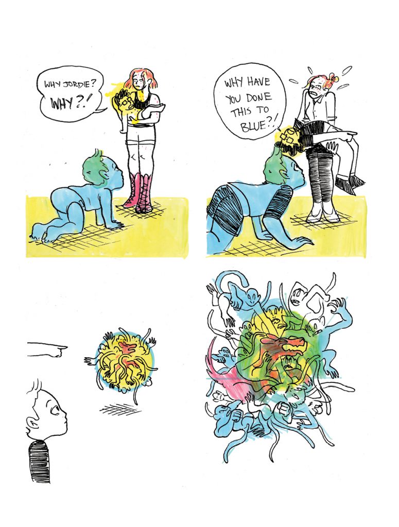
Joanie and Jordie – 12-7-2017 – by Caleb Orecchio
