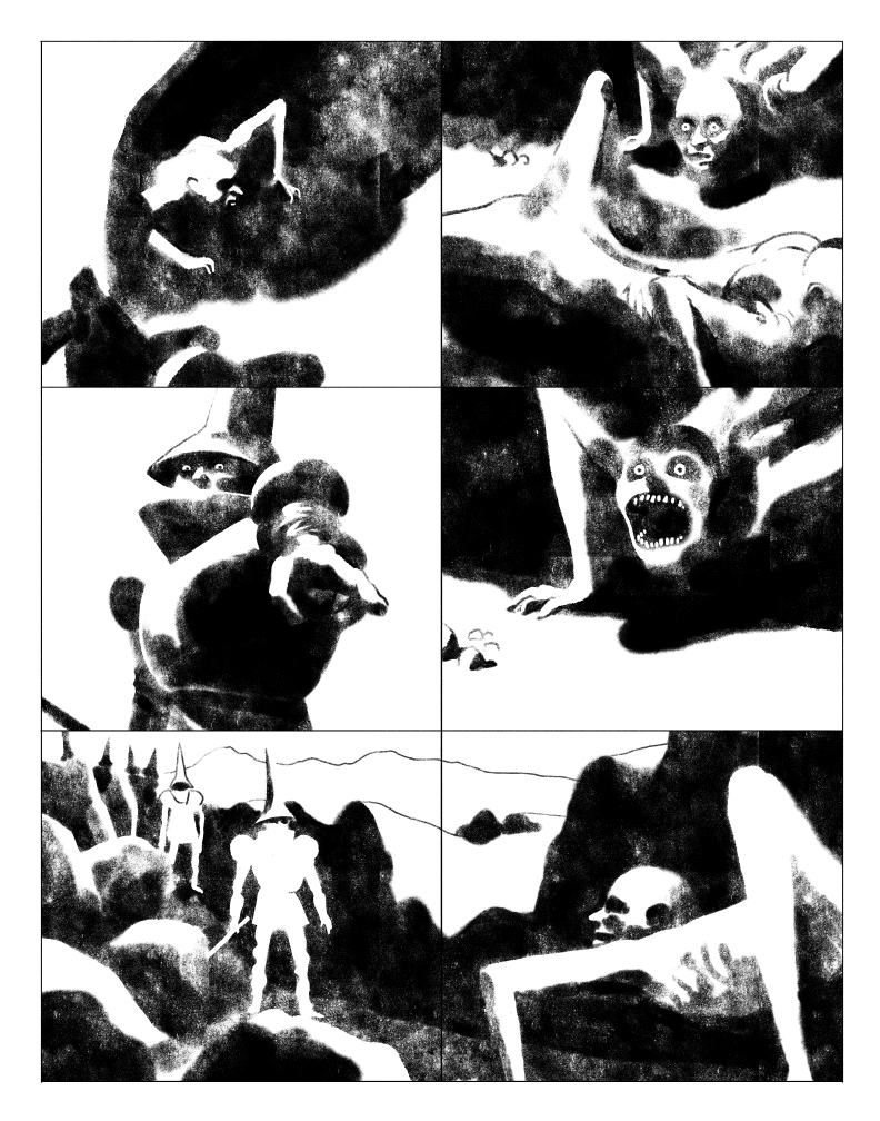
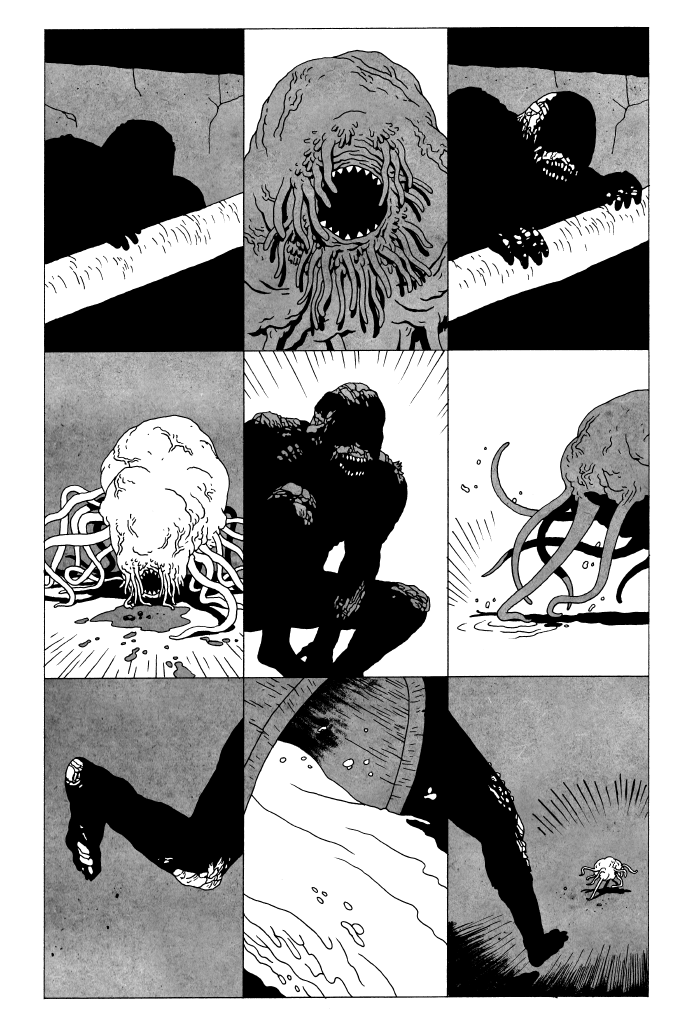
Tyler Landry has been working at a furious pace lately. I feel like every time I look up from my own drafting table, Tyler is dropping some new comic on the scene, usually oozing mood and style, and generally being just great exercises in atmosphere and design. He’s had work published online by Study Group, as well as many projects on the Comics Workbook Tumblr. In print, he’s published several well-received works under the shared label Clavicle Cocoris, and his latest work, Vile #1: The Coward’s Hole is coming to stores in May, also from Study Group.
 Kurt Ankeny: I know you work sometimes digitally and sometimes in analog media. What are your preferred tools for each technique, and how do you lay out your workspace?
Tyler Landry: I was asked something similar recently, and I’ve been thinking about it a bit, and I really don’t have any set in stone prescribed standards when it comes to tools and workspace. I’m sure this will make a lot of people angry, especially those who wanna know which pencils to buy, or which brush-set to use, or shit like that. I know that if you’re looking for certain specific, consistent final results your choice of tools can be critical—but the more comics I draw, the less I care about those kinds of things.
Let’s see now…
Stories come out of thin air for me, so where I begin can change—but generally I’m drawing, thumbnailing, or mocking-up sequences on whatever is close by. I’ve got heaps of sketchbooks, index cards, sticky notes, paper scraps. I wanna record these ideas as quickly as they come, so it’s literally whatever’s available. I suppose I prefer pens and fat markers for this work, because it’s gotta be fast, man. No silly lingering. Whether I plan on working digitally, or on paper, I’ll always start out this way. If I can’t touch the work, especially at this raw idea stage, it has no permanence for me, and it will slip away. This work happens anywhere—at lunch, at the coffee shop, at my desk at work, or while I’m watching TV in bed at night.
Kurt: I get that, completely. There’s often a sense as an artist that you don’t want to miss that initial spark that makes an idea exciting. For me, however, I often find that ideas that I churn out immediately fade in importance to me, where ideas that keep bubbling back up in my mind tend to create…more lasting? satisfying? work. Have you ever run into that, or do you just find your mind works oppositely?
Tyler: There’s always a few duds in the initial deluge, but even the less complete drawings and snippets of words tend to be seeds destined for big growth. I find too, that if I linger on an idea and work it over too much that it turns into garbage, and I’ll either scrap it or return it to its first version. I think most of the best stuff comes at the beginning for me because I’m not inhibited by what I’ve begun turning the story into, subconsciously censoring myself.

Kurt: Interesting. So you find your stories best in a Jungian sense, by tapping into that primal dream-world that we all have floating within us, is that fair?
Tyler: That’s not a bad way to put it, yeah. Every comic story I’ve ever done has come out of nothingness. I’m slowly learning how to interpret and condense all of the chaos and more efficiently transform it into useful material (pictures/words/narratives).
Kurt: Ok, so you have all these condensed ideas on various scraps of paper/notebooks, and then?
Tyler: I spread these scraps and cards all over my drawing table, or on the living room floor, and just start arranging. At this stage the only real workspace requirement is…well…space. I just need lots of room to arrange things. Whatever sat in sketchbooks gets translated to cards or sticky notes or whatever so it can be sequenced too. Always on papers, always drawing by hand. This hands-on arrangement is the best way to make sense of my ideas, by far. I find I have to revisit this process a number of times before I get what I want—always adding a new bit here, cutting an old bit there—till it feels totally complete.
Kurt: How much space are we talking? Because I often like to do this as well, but I run into the problem of “if I lay out the whole thing at once, I have to step so far away from it that I can’t read it”, and can only process it on a macro level. Are you processing at a macro level at this point? Just trying to see large shapes and spread layouts for whatever it is your after? And what is it that you try to capture on a macro level, design-wise?
Tyler: I always consider it per spread. The biggest picture anyone will ever get of the work, visually, is per page (in a web/phone scroll) or per spread (in print), so that’s how I arrange at this stage. I end up arranging by moments, or by scenes—essentially by spreads or groups of spreads, depending on the length of a discreet scene. I’ll work one out, set it aside, and spread out another. I’m looking for the pacing and completeness of ideas first, then I adjust the visuals—flipping cards for position/direction of forms, replacing a drawing with a different image representing the same moment/idea, or adding new drawings to lengthen a moment. I only consider things between spreads/scenes once I begin to feel like I’m covering everything story-wise and I really know exactly what I’m dealing with chronologically. Then it becomes about things like intensity in one spread, versus breathing space in the next, or whatever sorts of dynamics or glue the story feels like it calls for.
Kurt: So, not the whole story at once, gotcha. Just spread-by-spread…
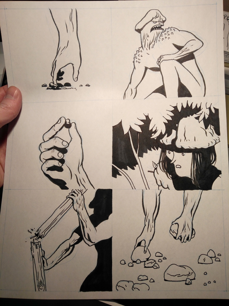
Tyler: If I plan on working digitally, I’ll photograph these arrangements, and use them as rough guides under my digital drawing. They don’t need to be precise. Analog setup might involve a light table and redrawing overtop of the cards, or just translating them by eye, in spirit, to paper. I have an old animator’s cartooning wheel, and I just stick a lamp behind it. For a while I would do some underdrawing in coloured pencil, mostly just to make sure I was nailing the layout and proportions, but I’ve all but given it up—it’s just too slow and fussy for me, and it can really contribute to flattening my results, so I just straight draw over the sequences in ink. Here’s where people are gonna get pissed off at me…
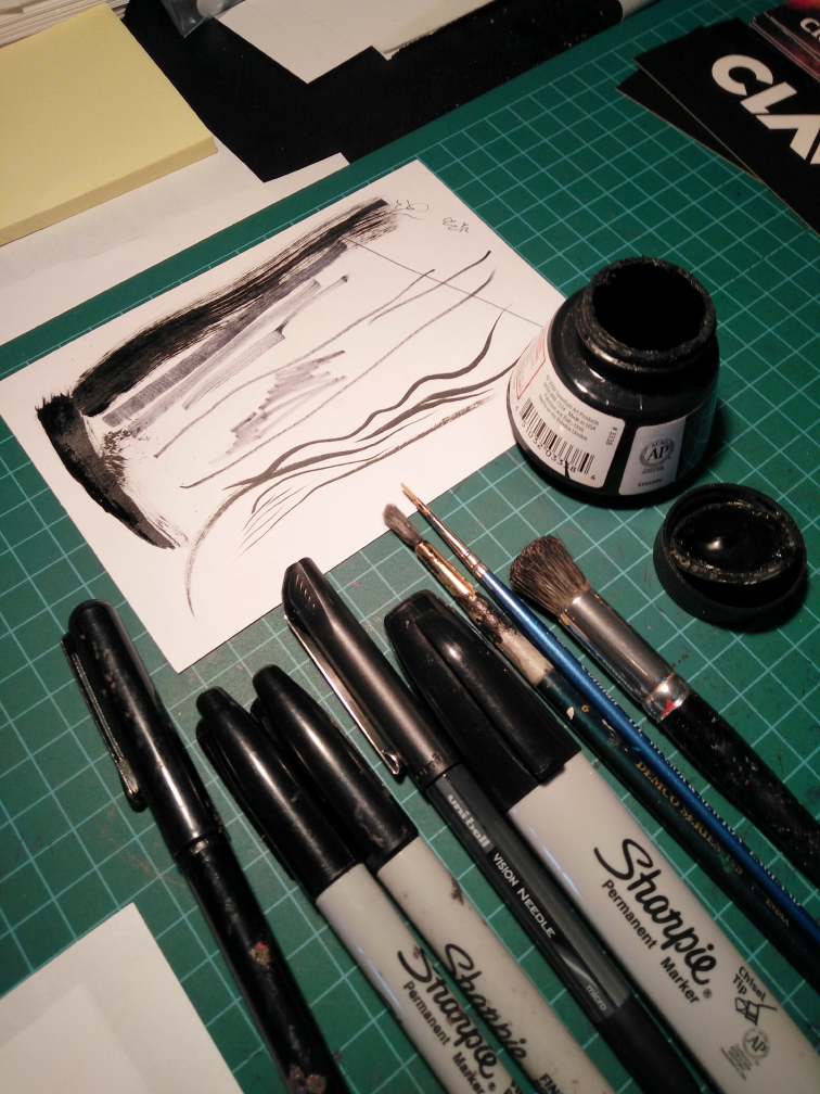
Pretty much every comic I’ve drawn naturally in the last few years has been on regular old shitty copy paper, often with a photocopied grid on it, inked with dying sharpies of all sizes and whatever smooth, black pens I can find. There are a handful of reasons for this, but the biggest one is speed. I just want to get the work together so I can scan it, and have it set up for reproduction. I also tend to draw a page, or a portion of one, and get that “I fucked this up” feeling, so I trash it and restart. Much easier when your materials are dirt cheap. My space for doing this is a standard drafting table. I’ve got a rubber cut-mat, heaps of paper, things that make marks, tape, my story cards, and I just draw. Page after page.
 Kurt: So what are the other reasons other than speed in your choice of these materials to make the final work? And are all of these dying and fucked up markers just naturally occurring, or do you do stuff to them to fuck them up to the point where they’re making the marks you’re after? If you don’t fuck them up on purpose, what’s the point at which you know they’ll work for what you want them to do?
Tyler: I can’t remember a time when I didn’t have destroyed markers, rotten brushes, or crusty old ink bottles lying around. I don’t wreck ‘em on purpose for any specific effect, I just never throw them out until they’re actually not making marks anymore. With that said, I suppose I just pick up something when I think it’ll work for me. For instance, dying markers are great for tonal gradient in otherwise flat black work, and one of my favourite parts of them is that they’re a little unpredictable, so I use them sparingly and in places where I can let a little chaos occur. They also translate well to high-res bitmap art. Crusty gross magic happens when the software has to decide between only black pixels and white ones. Another thing I like, and am just learning how to use to my advantage, is the uncomfortable balance between tools that really aren’t meant to compliment each other. Fat bent marker tips, leaving bled out blobs on the ends of their lines mixed with a mutilated dried out brush, mixed with ballpoint pen, slightly bled out in more deliberate strokes, and hair-thin where i’ve drawn more quickly. Yup.
There are a few exceptions to this cheap and dirty rule. When I did Likeness I used a Pentel brush pen. Primarily because of the ease of getting mixed thick and thin lines with a single stroke. It’s a little more organic than mechanically building up those thicks and thins, and it served me well for that project. I also used it a bit for portions of Clav City—again, a case of ease with thicks and thins, and separating organic content from more rigid stuff. Otherwise it’s been sharpies, miscellaneous brands of thin ballpoint/gel style pens, and a few occasional heavy-handed dumps of crispy, ill-treated, cheap brushes and dried up rehydrated india ink. My original pages are probably disintegrating as I type this.
Kurt: All the best artists rarely care about what their originals are going to look like, years down the road. I’m often paranoid that my insistence on using stuff that’s going to last is keeping me from doing my best work…but anyway. Let’s talk about line quality. What do you look for in your linework? I see a copy of Domu on your desk, and you often work in what Toth would’ve called a “dead line” which is just a line with little to no variation in it. Like from a ballpoint or felt-tip pen. And then you flavor it with spotted blacks that are rougher and contrast with those clean “dead” lines. So are you after different things when you choose to use the brush pen, and what drives your decision about which tools to use on a particular story?
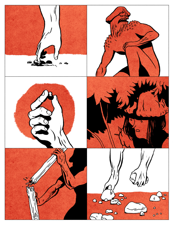
Tyler: I borrowed Domu from a friend, and only just started into it, so I couldn’t say much just yet. Otomo has always had a very deliberate, precise, line-quality-aware rendering style, though. I think I used to try to work that way, but I’ve really been trying not to climb anyone else’s tree these past few years. I’ve been trying, bit by bit, to strip all of the style and decoration and residual aping from my work, and reduce it to its barest necessities. When it comes to mark-making tools, I choose based on what kind of visual language I think will benefit the feel of the story. There’s a certain smooth elegance to the brush (or brush pen), something I used heavily in Likeness because it dealt with things in the natural world, human bodies, flab, muscle, jungle creatures, and the moods varied from sad, to furious, to tender. There’s a more rugged quality to writing pens, which is I what I used when I did Lonesome, about a crusty old prospector, scrubby, unforgiving nature, and fear. I try not to think about flavour in every stroke. I choose some tools overall, and apply them in the moment as best I can to compliment each other and the thing I’m trying to convey in any one panel or drawing. I’d say just as much as the tools, the way in which I compose and control the drawing has a lot to do with the final flavour of it. Where Likeness and Clav City have more structured, controlled, clean setup, even a bit of underdrawing, Lonesome was all off the cuff, ink on the page, no preparation type drawings—full of energy and mistakes all the way through.
Kurt: Ok, so what should I make of the fact that one of your most visceral works, Shit and Piss, is done in the dead-line/crusty spotted blacks style? Is it because this is less warm than the Pentel brush style….less…human? Or should I just not make anything of it at all? (laughs)
Tyler: You more or less hit that nail on the head, yeah. When I set out to do Shit and Piss, I had intended for it to be much more sloppy and mean in its execution—but I lost a certain level of visual clarity there. That’s my super anal, “all things must be perfect” nagging voice guiding me a bit too much. I didn’t have the confidence to proceed with the madness, so I decided to go for something so plain that it was almost dull—pretty far down to the other end of the spectrum. It was partly its lack of humanity, and partly a bit of a challenge in simplification (in some aspects).
Kurt: Ok, I have this pet theory, and it pertains to this thing I think you’re describing. And that is: it’s very difficult to make an “arty” SF piece, because if you want to explain/guide the reader through a weird/foreign/alien world, you need to be clear so that they know something is weird, or alien, and so that they don’t just throw their hands up and say “what the fuck is going on???” And that need for clarity imposes certain limitations on the way you present the story. Do you find yourself running up against this in your work? I feel like you tried to get past this with The Jaundiced Eye…
Tyler: This is a REALLY GOOD question. In retrospect I think I’ve played in the same sandbox as your pet theory, but never interacted with it directly. In Shit and Piss, the desire for clarity I’m speaking of was purely (initially) a visual one. The ability to describe a creature, a room, a pile of bones, etc. as clearly as possible felt essential to me. It’s also lent the story a particular layer to its identity, overall. But that’s all surface. Those things don’t require the absolute to-the-detail clarity I had originally aimed for, and their purpose as devices, lending/bending meaning to certain aspects of the stories really only requires their mere suggestion—something I really felt I succeeded in achieving to a much larger degree in The Jaundiced Eye—thanks for noticing. The limitation I see in overindulgence in “clearing everything up” like that seems to be one of potential. When reducing everything to its technical, clinical definition (which is what it feels more and more like to me), you lose the potential to let it speak for itself and add its own depth to the story. You also run the risk of beating people over the head with identifying things, or shifting the balance of focus onto less important aspects of a given thing. Comics has so much room for subtlety, a veritable mille feuille, and I feel like i’m just lifting the topmost layer.
Kurt: I liked The Jaundiced Eye because it really felt like a weird style, like cut out stencils that were sprayed with a fucked-up airbrush. It was jarring and disorienting, which I felt added to the story’s mood tremendously. I also am interested in what you said about “Crusty gross magic happens when the software has to decide between only black pixels and white ones.” So you’re using the computer’s choices in the final art too? Do you play with the Threshold settings (in Photoshop) a couple of times to find the best version of the bitmapping to your eye?
Tyler: Thanks! The Jaundiced Eye was a tough nut to crack. I had these little ideas about pointy hats and an oppressive fear cloud hanging over a village for a while, and I actually boarded out the whole story a bunch of months ago and it’s just been sitting, waiting for the right treatment to justify its existence. I drew the first spread 3 or 4 times in a different hand/tool/style to try and figure out how it wanted to be shown, but no luck. Stuff was too fussy, too contrived, didn’t serve the feel I was hoping for. One evening I was doing some wicked loose drawing with really dull pencils and had a proper eureka moment. The idea of swaths of crumbling noise with just minimal detail for recognition’s sake punched out—that was it. I found a couple of PS brush tool combos that worked and the thing took me no time at all to draw—just painting in huge fields of mess and cutting back silhouettes from them. This story didn’t see any of that black and white magic transformation because it was done 100% digitally, and I kept the greyscale very smooth and soft and anti-aliased, so everything was kinda set up ahead of time to do its job. The magic tends to happen for me when I’ve scanned art with gradients, or when I decide to paint tone or gradient digitally, in a soft, greyscale sort of way—and then convert to bitmap. It’s just how hard I hit the threshold. Usually just a matter of adjusting levels a bit for the results I want.
 Kurt: Since we’re on the topic anyway, let’s get into how you work digitally…
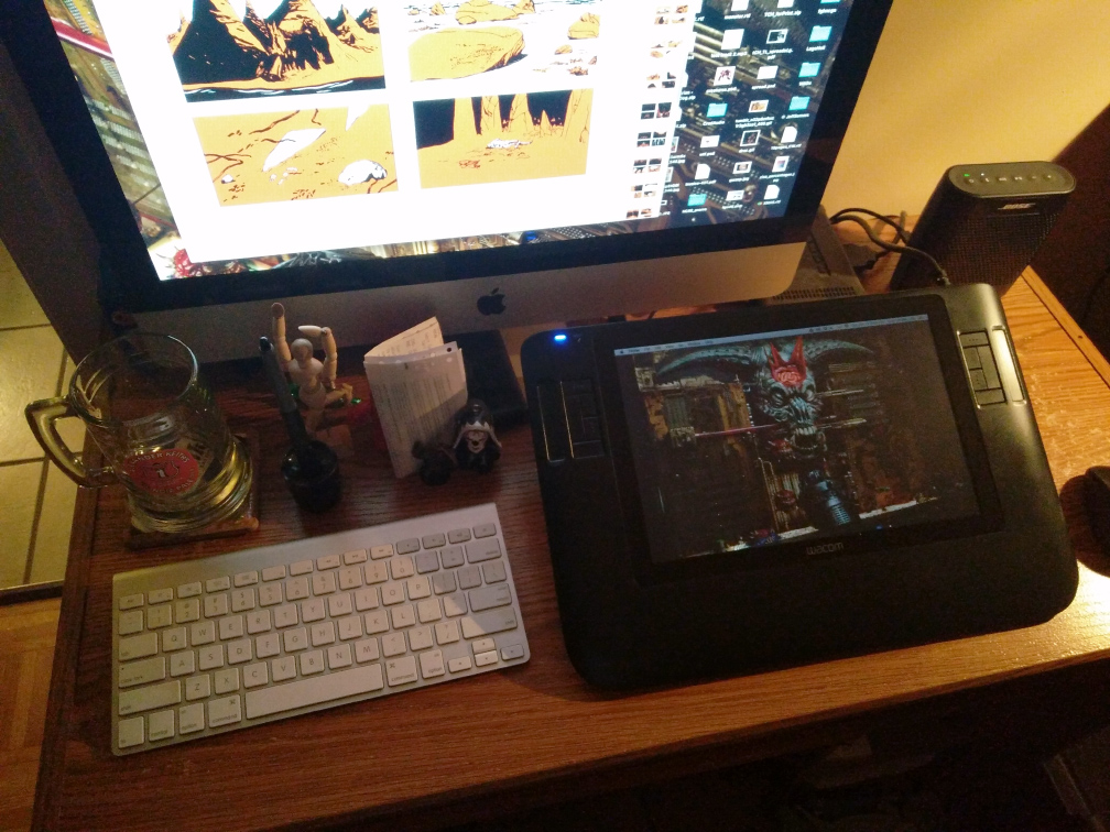
Tyler: When I’m working digitally I work in a more reductive way. What I mean by that is that I generally apply much more black than I will need anywhere, and shave it back with an eraser—something that differs a lot from my analog drawing process. Workspace in this sense is pretty sparse—I use a Cintiq and work in Photoshop. I draw primarily in one black layer, often with one additional black layer set to 40% opacity so I can get that secondary tone in there. I usually use just a couple of brushes I made myself from scans of old drawings—a couple for ragged lines/blobs, and a couple of others for spatter and gradient tones. Recently I made use of some of the famous Kyle Webster’s brushes to do The Jaundiced Eye, but that’s about the only deviation I’ve made to date.
Kurt: And let’s talk real technical: how do you set up your pages for print: dpi, scan rates, any special tricks you use that give you the print job you’re after with these projects? Does it vary significantly between black & white or color?
Tyler: Whether scanned or straight digital, I usually work at 600dpi. I’ve been told to work higher, but with a bunch of layers and large(ish) pages, I tend to get drawing lag which makes it pretty unworkable. I work pretty much exclusively in Photoshop, because I know it, and I can achieve pretty much anything I care about in it. I also tend to save my pages as individual PSD files. I know some people do some major huge spread files, or entire story files, or use smart objects or whatever, but I keep it pretty simple. I don’t like all that shit getting in my way. As for the work itself, anything that’s straight black, or flat coloured, I work in plain bitmap—that is no anti-aliased edges. Every pixel is black, or white. Gives much more crisp end result when going to print—I’ve found. I’m not a pressman, though, so my tricks don’t go too deep there. I don’t do much “color” work, other than flats like I’ve done with Likeness and Hermit Crab Real Estate, which are essentially straight black layers printed in a color other than black. In that respect, it really doesn’t vary much at all between straight b/w and color work for me—except that I trap my colors properly (combination of applying a stroke and hand painting in some of the non-uniform stuff) since they’ll be printed in separate passes. Shit and Piss has been totally black and white, right down to the textures I crafted and paste into the “tone” layer. When I do the covers, it’s a free-for-all, methods-wise, anything goes, eventually creating a duplicate, baked flat, converted to CMYK and tweaked for balance as best I can. Clav City, and Lonesome use a couple of transparent colors/tones that overlap to give an additional color/tone—but being made for the screen as they were, they’re just plain old PS layers with multiplication/transparency applied to them. Translated to the page, I’d be reworking them similarly to the previous examples, flat layers, trapped, relying on transparent inks, or a full 4-color process to keep the balance and legibility. All of the setup/process I just described is becoming a bit stale for me, as most of my recent work has been done with slight variations on the same methods—so I may be exploring a new approach soon. Something to refresh me, and the work.
Kurt: So, what’s coming up for you as far as work, and what are your personal struggles in your art as you see it? What are you trying to attain that you feel you haven’t yet? I’m curious as to where artists are aiming, how they envision their “perfect” masterwork and what it contains. What kind of influences or ideas are you trying to put into your art that you feel you haven’t figured out yet?
Tyler: Upcoming work includes quarterly (I hope) installments of Vile, via Study Group. Each of these will be a unique story, under the common banner of Vile. I also plan on doing two more Shit and Piss tales, then to collect all five in a single volume. Those are the hard commitments I’ve made. In addition, I’ve got a pile of stories in various states of early note-taking, card-drawing, narrative building. They’ll all find their way into finished-ness sooner or later. I’ve got a story about future life on Mars, a sort of “interview” with a vampire, a folly of youth story with heavily relevant societal undertones, a book of landscapes, more chapters of Clav City, and so on…
My personal struggles stem from and guide my aspirations. I grew up copying style. Always. I was a fan of so many painters, illustrators, cartoonists, and spent years just learning how to execute like they did. The fundamentals came later when I realized I hadn’t any voice for sharing my own ideas, and needed to build up from the ground again. I’m forever trying to shed the trappings of stylistic shackles—either by purposefully altering my visual approach every time I draw a new story, or by drawing at such a base level that style doesn’t even come into play. I’d love to someday be able to execute my drawings on a completely raw and primitive level, using only the bare necessities. With those ideas constantly nagging at me, my deeper more longterm aspiration is really just to continue to expand on and really develop my ability to tell relevant (I hope) stories within the medium of comics. It really is capable of so many wonderful, dynamic, and infinitely subtle things, and I want to explore, invent, and master them all—built up around stories that actually matter. To someone. Somewhere.
Many thanks to Tyler for taking the time to discuss all of this over email!
Kurt Ankeny is a cartoonist working in Ipswich, Massachusetts. He’s the co-author of the Santoro School Handbook for Making Better Comics, and the author of Saltwater Snow, A Bomb, and the upcoming In Pieces: Someplace Which I Call Home, which is currently being serialized on the Comics Workbook Tumblr. You can find him on Tumblr as well as at www.kurtankeny.com.
Great interview! Excited for more
Fantastic interview, I could read about the nitty-gritty of your process all day. Drawing directly in a Photoshop bitmap is brutal, I love it.
Great stuff! Really like the last question (and answer).
Thanks, all! I’m looking forward to talking to more creators too, and digging into their process.
Um, how come your Zona doesn’t look like any i’ve seen before?!?!?
Great interview, reading about other people’s process always makes me feel better. Brothers & sisters untied in some form of creative suffering. Keep rockin on!
That’s just a box my Zona (and some other items) came packed in.