Caleb Orecchio here with thought’s on the eloquent minimalism of Gilbert Hernandez and Charles Schulz, and other news.
—————————————————————————————————
Beto’s art has really loosened up and minimized visual information in the last 10 years or so, to the point that only essential information remains. His lines these days are thinner and crisper, more straight-forward and lack the luscious thick-thin contours of his earlier work (in a good way). This, to me, has given his work an enhanced readability and lends his pictures to nearly instant comprehension. To illustrate my point, I will paraphrase (from memory) Gilbert from his Q&A at SPX 2017 where he paraphrases Wally Wood about Nancy by Ernie Bushmiller: As soon as you see a Nancy strip, you’ve already read it before you decide if you like it or not.
Schulz, of course, may be the greatest example of minimalism in comics with instantly recognizable characters made up of a handful of squiggly lines. Beautifully articulate face expressions made with a few swipes of his nib. The information in Peanuts is often communicated through dialogue between characters strolling through space, and it’s his simple visuals that invite us in to casually follow along with little to no effort. Beto, in my opinion, has seemed to cracked this same minimalist code of gorgeously-simple visual stimulation that eases the senses giving way to willful submission to the story one holds in one’s hand.
A lot of what I admire about this kind of minimalism both Beto and Schulz embody is in their backgrounds. Consider this spread by Gilbert in Love and Rockets #4 (vol. 4):
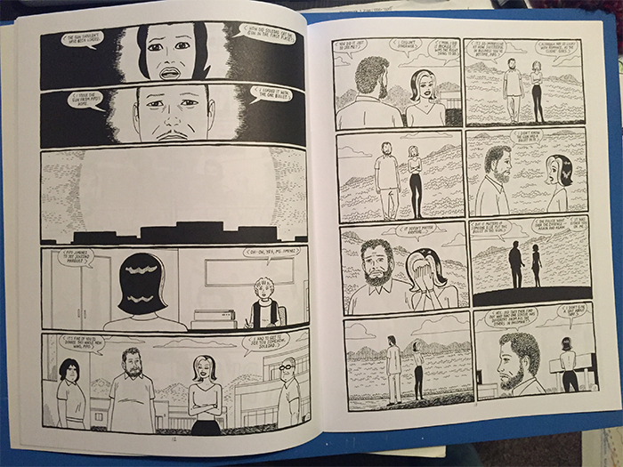
More specifically, consider what information the backgrounds illustrate.
The page above (pg. 12) starts with two panels with two respective characters giving their sides of the story. Panel 3 is a sunrise over a town or city, panel 4 is a woman walking into an office, and panel 5 has two people chatting in public within earshot of others. Then, see page 13, we see these same characters talking in what seems to be a secluded area surrounded by more a more rural backdrop, nobody is in sight and the conversation is more serious with less smiling and pleasantries.
The above are aspects I rarely notice outright, but seem to unconsciously understand as I read the issue. It’s a seamless process for me as a reader, very enjoyable with very few unnecessary distractions. The tone is clear as a bell despite the subtleties that I’m only aware of in careful study.
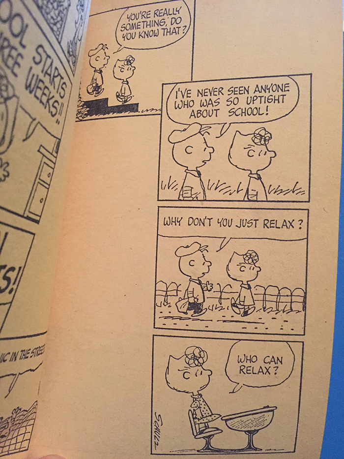
Schulz’s work functions similarly: consider the strip above. A simple sequence of a brother and sister’s walk to school down their porch stairs, along the road and into a desk. The subject of the dialogue is “school,” while the simple route they take gives the “impression” of a morning walk to school, and the desk solidifies it. Yet, we never consciously think, “they are walking to school,” we just follow them to Sally’s desk just as naturally and unconsciously as one would travel from the kitchen sink to the refrigerator.
Am I clear as mud? I suppose I find it interesting that Beto tends to be moving more towards the likes of Schulz and less like earlier influences of Kirby or Ditko or even Crumb in terms of picture-making. Simple, minimal, clearly articulated sequential-images that sweep your eyes along with little to no hinderance. These are beautiful comics that I think help define the essence of cartooning at its purest.
—————————————————————————————————
if you don’t know, now you know
- At PEN American, Whit Taylor guest edits and hosts an excerpt of Kurt Ankeny’s comic, In Pieces: Some Place Which I Call Home.
- Chris Ware talks to Dmitry Samarov at the Chicago Reader.
- Sally linked to this article last week, but I felt it was worth linking to a second time, Serious Sex Battle: The Myth of the Wonder Woman by Sarah Nicole Prickett at Artforum.
- TCJ.com is rerunning an interview with Mort Walker, who recently passed away, from 2009 conducted by R.C. Harvey.
- Will John Porcellino be coming to your town this year? Find out!
- I always enjoy Arlen Schumer’s presentations on Kirby, and and especially how vehemently he waves the Kirby flag in this particular instance.
- Last but not least, please enjoy this two part video of some program of the second annual Mighty Marvel Comic Art Convention in 1976. Includes classic Stan Lee feeling like a celebrity, but the best parts are: 1.) the Q&A with then-new editor-in-chief Archie Goodwin and 2.) John Buscema drawing Conan live which ends with a standing ovation.
—————————————————————————————————
 Suzy and Cecil – 2-5-2018 – by Gabriella Tito